Over the years of building websites for clients ranging from small businesses to growing online platforms, I’ve learned one truth: a website is only as good as its ability to grow. Responsive web design isn’t just a nice-to-have feature anymore—it’s the foundation that determines whether your site can handle more traffic, more content, and more users without breaking.
In this post, I’ll share what I’ve seen working in real projects: how responsive web design contributes to truly scalable websites, the role web developers play, and practical steps you can take whether you’re starting fresh or considering website redesign services.
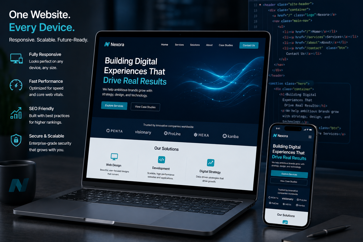
What Responsive Web Design Really Means for Scalability
Responsive web design is the practice of building websites that adapt seamlessly to any screen size—desktop, tablet, or mobile—using flexible grids, images, and media queries. But its impact goes far beyond looking good on phones.
A scalable website must handle increasing loads while maintaining speed and usability. Responsive design supports this by reducing the need for separate mobile sites, which often create maintenance nightmares. One codebase serves everyone. That means fewer bugs, faster updates, and lower long-term costs.
From my experience, sites built with proper responsive principles load faster on mobile (where most users now browse) and perform better in Google’s mobile-first indexing. This directly affects visibility and growth potential.
The Web Developer’s Role in Creating Scalable Solutions
As a web developer, my job isn’t just writing code—it’s anticipating future needs. When clients come to a websites design company like mine, they often focus on the look. I push for scalability from day one.
This includes choosing the right framework (WordPress for content-heavy sites, Webflow for more designer-led control), implementing clean code architecture, and optimizing performance. Responsive web design sits at the center because it influences everything from navigation to image handling.
I’ve worked on projects where ignoring responsiveness early led to painful redesigns later. A good developer plans for growth: modular components, efficient CSS, and performance budgets that stay realistic as the site expands.
Why Scalable Websites Matter for Business Growth
A slow or broken mobile experience costs real money. Studies show that even a one-second delay in load time can reduce conversions significantly. Responsive web design helps prevent that by delivering optimized experiences across devices.
I remember one client who came to me after their old site crashed during a marketing campaign. Traffic spiked, but the non-responsive design couldn’t handle it. After a proper rebuild focusing on responsive principles and scalability, their site not only survived bigger campaigns but improved conversion rates by over 40% in the following months.
Whether you run an online course platform (similar to tools like Kajabi or Thinkific) or an e-commerce store on Shopify, scalability determines if your digital presence supports your ambitions or holds you back.
Step-by-Step: Building a Scalable Website with Responsive Web Design
Here’s the practical process I follow with clients:
- Discovery & Planning – Understand current traffic, future goals, and content strategy. Identify must-have features versus nice-to-haves.
- Mobile-First Design – Start designing for the smallest screens first. This forces clean, efficient layouts that scale up naturally.
- Choose the Right Platform – For most clients, I recommend WordPress.org because of its flexibility and vast ecosystem. For more visual control, Webflow offers excellent responsive tools out of the box.
- Implement Flexible Layouts – Use CSS Grid and Flexbox. Set images to max-width: 100% and use srcset for responsive images.
- Performance Optimization – Compress assets, implement lazy loading, and minify code. Test with tools like Google PageSpeed Insights.
- Testing & Iteration – Test on real devices, not just browser resize. Gather user feedback and refine.
Following these steps consistently leads to websites that grow without constant overhauls.
Common Mistakes and How to Avoid Them
Many businesses still treat responsive web design as an afterthought. Here are pitfalls I see often:
- Fixed-width layouts: These break horribly on mobile. Always use percentages or relative units.
- Heavy hero images without optimization: This kills load times. Use modern formats like WebP and proper sizing.
- Ignoring touch targets: Small buttons frustrate mobile users.
- Over-relying on plugins: On WordPress sites, too many plugins can slow things down. Choose quality over quantity.
- Skipping regular audits: Even well-built sites need maintenance. Schedule performance checks every few months.
If your current site feels slow or outdated, professional website redesign services can fix these issues systematically rather than patching them.
FAQ: Responsive Web Design and Scalable Websites
What is the main benefit of responsive web design for scalability?
It allows one website to serve all devices efficiently, making maintenance easier and improving user experience as your audience grows.
How much does a responsive redesign typically cost?
It varies widely depending on complexity. Simple sites start lower, while custom platforms with many features cost more. The return usually comes through better performance and conversions.
Is WordPress good for scalable websites?
Yes, when built properly. WordPress.org powers millions of sites because of its scalability potential with good hosting and optimization.
How do I know if my website needs redesign services?
Slow load times, poor mobile experience, outdated design, or difficulty adding new content are strong signals.
Can a developer make any website scalable?
Not every site, but most can be improved significantly. The key is planning ahead and using modern, maintainable code.
What’s the difference between responsive and adaptive design?
Responsive uses fluid grids that adjust continuously. Adaptive serves fixed layouts based on breakpoints. Responsive is generally more future-proof for scalability.
Building Websites That Last
Responsive web design is no longer optional if you want a website that grows with your business. It forms the backbone of scalable, user-friendly experiences that perform well today and years from now.
Whether you’re launching something new or refreshing an existing site, focusing on these principles pays off in traffic, conversions, and peace of mind.
If you’re ready to build or improve a scalable website, I’d love to help. Visit my personal site at shihabmorshed.com or check our services at Digital Wind IT to get started. Let’s create something that works as hard as you do.