I’ve been building websites for over a decade, and one truth has become crystal clear: a beautiful site means nothing if visitors leave in seconds. The difference between a site that gets clicks and one that generates leads or sales often comes down to one thing — responsive web design done right.
In this post, I’ll share what actually works based on projects I’ve handled through my work at Digital Wind IT. You’ll learn how to build websites that look great on every device and, more importantly, guide visitors toward taking action.
Whether you’re a freelance developer, part of a websites design company, or handling website redesign services for clients, these strategies will help you create sites that convert.
Why Responsive Web Design Is Non-Negotiable in 2026
Most traffic now comes from mobile devices. Google has been mobile-first for years, and the gap keeps widening. But responsiveness isn’t just about fitting content on a small screen — it’s about delivering a smooth experience that keeps people engaged.
I remember one client who came to me after their old site was losing customers. The desktop version looked fine, but on phones it was a mess — tiny text, broken navigation, and slow loading. After a proper responsive redesign, their bounce rate dropped dramatically and conversions climbed.
Responsive web design ensures your layout adapts intelligently. Images resize, fonts remain readable, and buttons stay finger-friendly. More than that, it builds trust. Visitors notice when a site feels professional and easy to use.
The Business Impact of a Well-Designed Converting Website
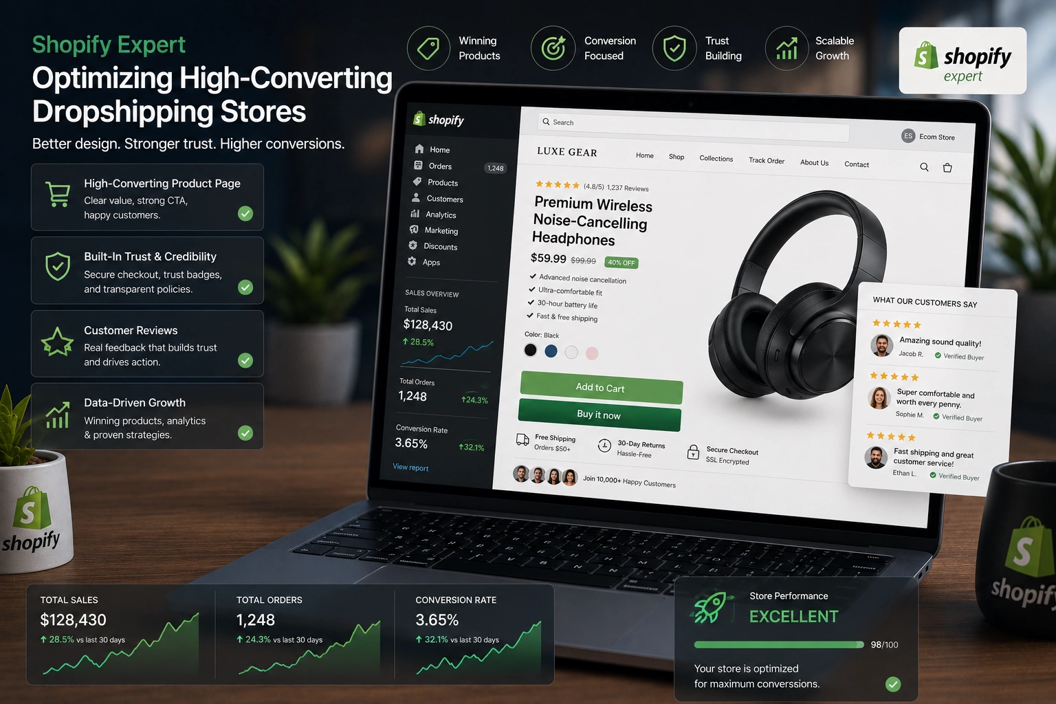
A good websites design company understands that design directly affects the bottom line. Sites with excellent responsive experiences see higher time on page, more page views, and better conversion rates.
From my experience, clients who invest in thoughtful website redesign services often see 20-40% improvements in key metrics. One e-commerce project I worked on increased mobile sales by over 35% simply by fixing the checkout flow and making the entire site truly responsive.
Think about it: when someone finds you on Google from their phone, they expect the same quality as on desktop. If your site frustrates them, they’ll leave and go to a competitor. A converting website removes friction and makes the next step obvious.
Key Elements of Responsive Web Design That Drive Conversions
Several factors separate average responsive sites from ones that actually sell:
- Fast loading times: Every extra second costs conversions. Compress images, use modern formats, and optimize code.
- Clear navigation: Mobile menus should be simple and accessible.
- Strong calls-to-action (CTAs): Buttons must be large enough for thumbs and placed where eyes naturally look.
- Readable typography: Scale fonts properly across breakpoints.
- Consistent branding: The site should feel like the same business no matter the device.
I always test on real devices, not just browser tools. There’s no substitute for seeing how a design feels in someone’s hand.
Step-by-Step: How to Build a High-Converting Responsive Website
Here’s the practical process I follow with clients:
- Research and Planning Understand your audience, their devices, and what actions you want them to take. Create user personas and map the customer journey.
- Choose the Right Platform For many projects, I recommend WordPress.org with a solid theme or page builder. For more custom control, Webflow offers excellent responsive tools out of the box.
- Mobile-First Design Start designing for the smallest screens first, then scale up. This forces you to prioritize content and functionality.
- Build with Flexible Layouts Use CSS Grid and Flexbox. Set breakpoints at common device widths (320px, 768px, 1024px, etc.).
- Optimize for Speed and SEO Implement lazy loading, minify files, and ensure proper heading structure. Test with Google’s PageSpeed Insights.
- Test Thoroughly Check on multiple real devices and browsers. Get feedback from actual users if possible.
- Launch and Monitor Use analytics to see where people drop off and make continuous improvements.
Following these steps has helped me deliver sites that clients are proud of and that actually perform.
Common Mistakes and How to Fix Them
Even experienced developers make these responsive design errors:
- Ignoring touch targets: Buttons too small or too close together. Fix: Keep minimum 44px touch targets.
- Overloading the mobile view: Trying to show everything from desktop. Solution: Prioritize and hide non-essential elements.
- Fixed width elements: These break on different screens. Always use percentages or responsive units.
- Poor font scaling: Text that becomes unreadable on mobile. Use relative units like rem and test thoroughly.
- Slow images: Not serving appropriately sized images for each device.
I once had to rescue a project where the developer used fixed pixel widths everywhere. A quick responsive overhaul saved the launch.
Another frequent issue is assuming your design works because it looks good in Chrome’s responsive mode. Always test on actual phones — the difference can be surprising.
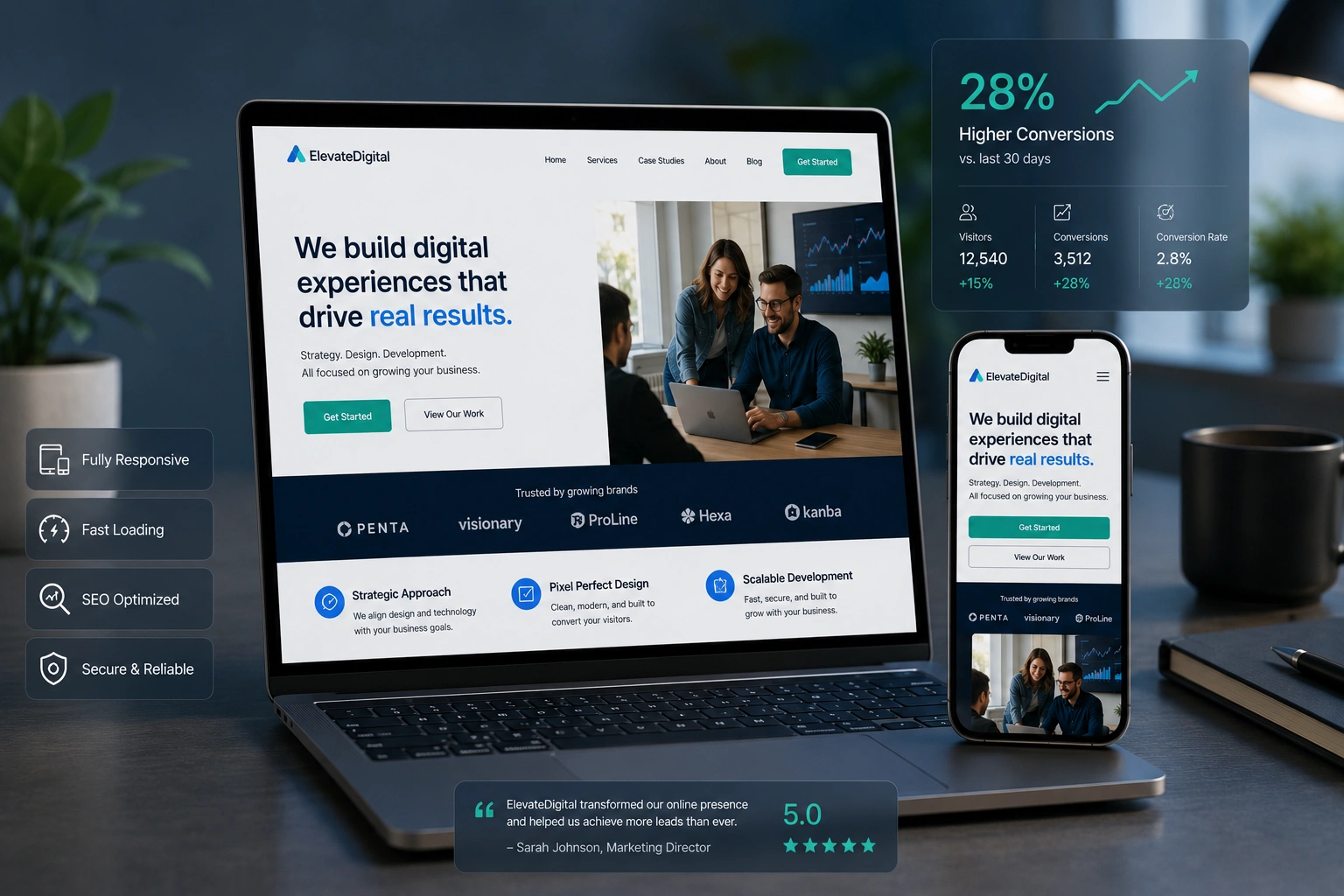
Real-World Example: From Static to Converting
One of my recent projects involved a service business struggling with leads. Their old site was built years ago without proper responsive considerations. After a full website redesign, we implemented:
- Mobile-first navigation
- Faster loading hero section
- Strategic CTAs on every key page
- Clear trust signals
Within two months, their contact form submissions increased by 62%. The client told me the new site finally felt like a professional extension of their business.
FAQ
What is responsive web design and why does it matter for conversions?
Responsive web design is an approach where a website’s layout and content adapt to different screen sizes. It matters for conversions because it reduces friction and creates a positive user experience across all devices.
How much should I invest in website redesign services?
It depends on your goals. A focused responsive redesign for a small business often delivers strong ROI compared to building from scratch. Focus on results rather than just aesthetics.
Is WordPress good for responsive design?
Yes. With modern themes and builders, WordPress sites can be highly responsive. The key is choosing quality tools and implementing best practices.
How do I know if my current site needs a redesign?
High bounce rates on mobile, low conversions, or complaints about the site on phones are clear signals. Regular performance audits help too.
Can a single developer handle both design and development for converting sites?
Absolutely. Many successful projects come from developers who understand both UX and technical implementation.
What’s the difference between responsive and mobile-friendly?
Mobile-friendly usually means the site works on phones but may not adapt beautifully. Responsive design provides a tailored experience at every breakpoint.
Ready to Create a Website That Actually Converts?
Building a site with strong responsive web design is one of the best investments you can make for your business or clients. It’s not about chasing trends — it’s about creating experiences that respect people’s time and guide them toward meaningful actions.
If you’re looking for expert help with your next project, feel free to reach out through my site or explore what we do at Digital Wind IT. I’m always happy to chat about turning your website into a real asset that grows your business.
What’s one thing you’re planning to improve on your site next? Drop a comment below — I read and reply to them all.