I’ve spent years building and redesigning websites for clients who initially thought a “good-looking” site was enough. Then mobile traffic exploded, bounce rates climbed, and they realized something was missing. That’s where responsive web design comes in. It’s not just about making a site look okay on phones — it’s about creating experiences people actually enjoy using, no matter their device.
As a web developer, I’ve seen firsthand how proper responsive web design turns frustrated visitors into loyal customers. In this post, I’ll share practical insights from real projects, the business impact, and exactly how to approach it.
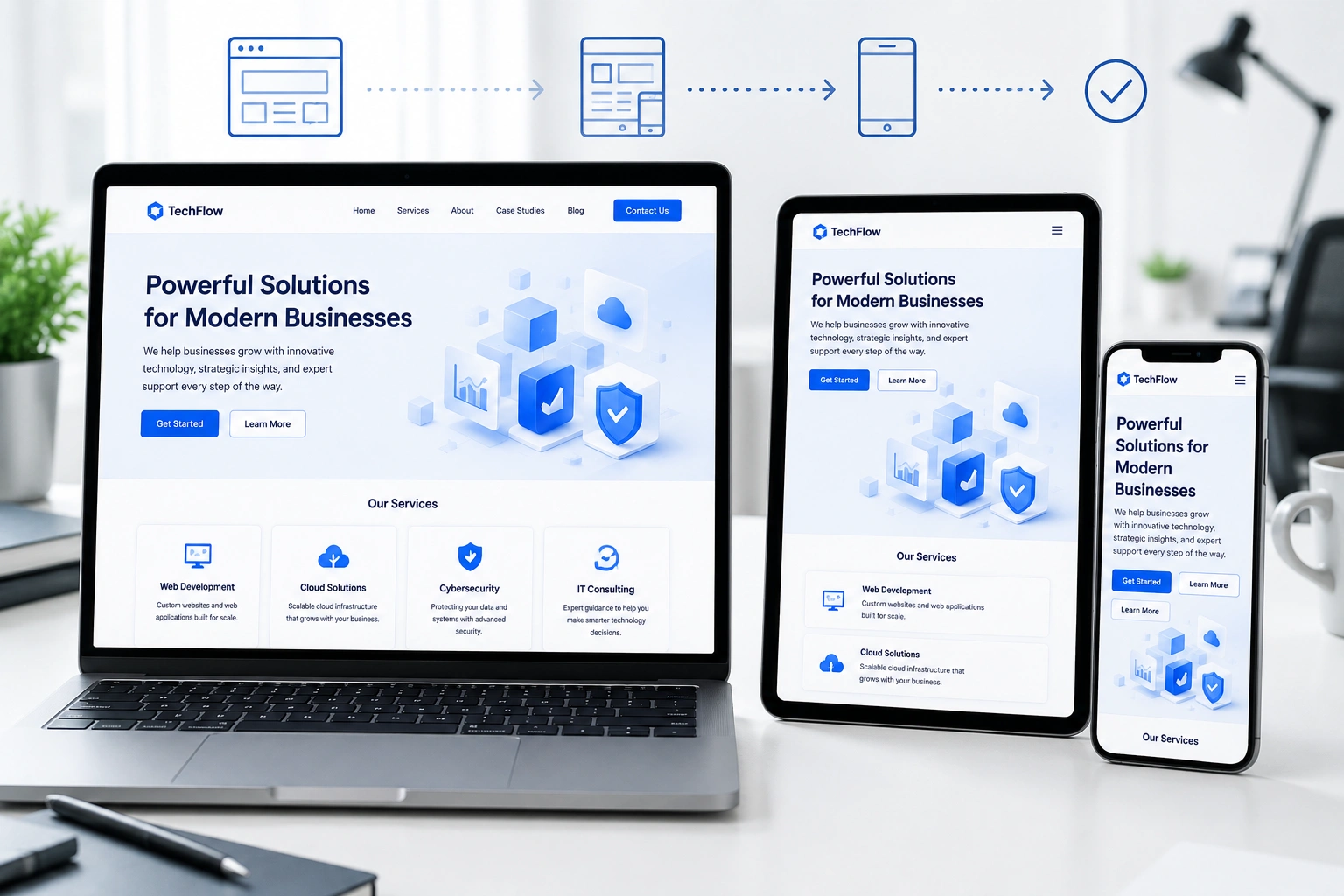
What Responsive Web Design Really Means for User Experience
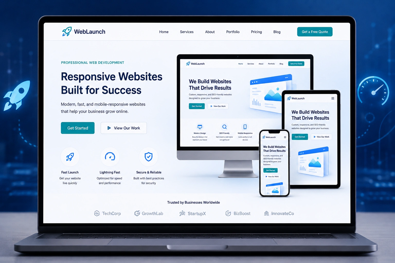
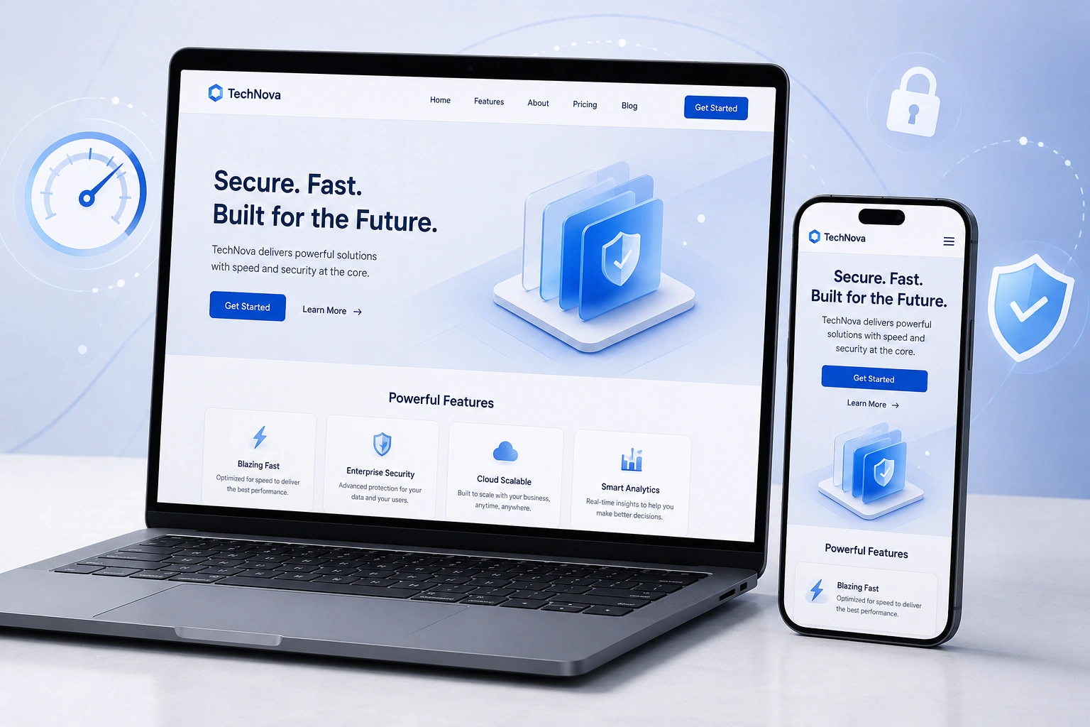
Responsive web design uses flexible layouts, images, and CSS media queries so your site automatically adapts to any screen size. No more pinching, zooming, or horizontal scrolling on mobile.
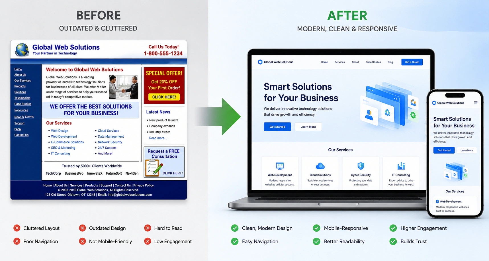
I remember one client who came to me after their old site lost traffic. On desktop it looked fine, but on phones, navigation hid behind tiny text and buttons were impossible to tap. After a website redesign services overhaul with responsive principles, their mobile sessions increased dramatically and time on site went up.
Google’s mobile-first indexing makes this non-negotiable. The search giant primarily uses the mobile version for ranking. Sites that deliver poor mobile experiences simply don’t rank well anymore.
Core Benefits: Why Responsive Design Matters More Than Ever
Good responsive web design delivers benefits that go far beyond aesthetics:
- Faster load times and lower bounce rates: Flexible images and optimized code mean pages load quickly everywhere.
- Better accessibility: Proper structure helps screen readers and users with disabilities.
- Improved SEO: Google rewards mobile-friendly sites.
- Higher conversions: Smooth navigation and readable content encourage action.
One comparison I often make: A non-responsive site is like a physical store with doors too narrow for half its customers. A responsive one welcomes everyone through the front door effortlessly.
Data backs this up consistently. Sites with strong mobile experiences see significantly higher engagement and conversion rates.
How a Websites Design Company Drives Business Impact
When I work with businesses through my websites design company approach at Digital Wind IT, the focus is always on outcomes. Responsive design directly affects your bottom line.
Clients who invest in proper website redesign services often report 20-50% improvements in key metrics like time on site and form submissions. One e-commerce project I handled saw mobile conversions nearly double after implementing a fully responsive layout with fast-loading product images and easy checkout flow.
For online course creators or service businesses, this matters even more. Platforms like Thinkific or Kajabi emphasize mobile learning — your marketing site needs to match that experience.
Step-by-Step: Implementing Responsive Web Design
Here’s the practical process I follow on every project:
- Start with mobile-first planning: Design the smallest screen version first. This forces you to prioritize content and functionality.
- Use flexible grids and media queries: Build with percentages and relative units (%, em, rem) instead of fixed pixels.
- Optimize images and assets: Implement responsive images with srcset and compress everything. Lazy loading is essential.
- Test navigation and touch interactions: Ensure menus collapse nicely and buttons have adequate tap targets (at least 44×44 pixels).
- Validate with real devices and tools: Use browser dev tools, but also test on actual phones and tablets. Run Google PageSpeed Insights regularly.
- Iterate based on analytics: After launch, check heatmaps and behavior flows to refine further.
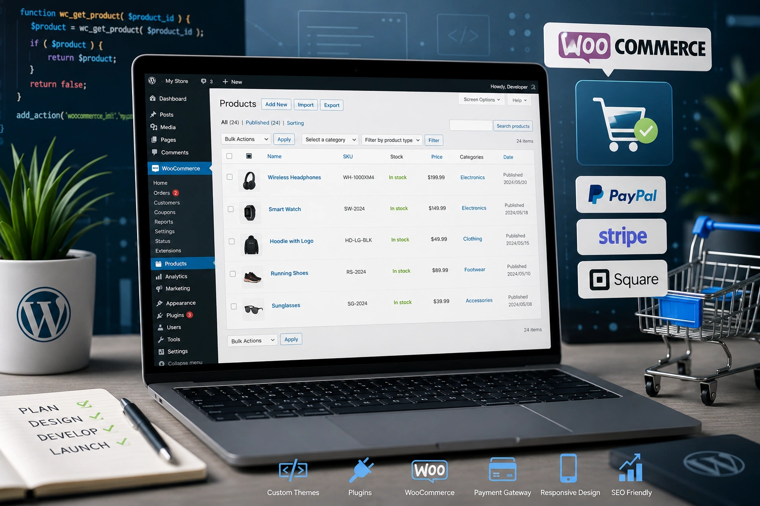
This approach works whether you’re on WordPress, Webflow, or custom code. For WordPress users, themes like those from the official WordPress.org repository often include solid responsive foundations.
Common Mistakes and Troubleshooting in Responsive Projects
Even experienced teams slip up. Here are pitfalls I’ve fixed many times:
- Desktop-first thinking: Starting with large screens and squeezing down leads to hidden content or poor mobile UX. Always go mobile-first.
- Ignoring performance: Heavy images or unoptimized JavaScript kill mobile speed. Solution: Audit with Lighthouse and prioritize critical rendering path.
- Inconsistent breakpoints: Using arbitrary screen sizes instead of content-based ones. Test at 320px, 480px, 768px, 1024px, etc.
- Touch-unfriendly elements: Tiny links or hover-dependent interactions. Fix by increasing spacing and providing clear feedback.
- Forgetting accessibility: Missing alt texts, poor contrast, or non-semantic HTML. Use tools like WAVE for checks.
In one website redesign services project, the client had beautiful desktop visuals but terrible mobile load times due to unoptimized hero images. Trimming those alone cut load time in half and recovered lost traffic.
FAQ: Responsive Web Design and User Experience
What is the main role of a web developer in user experience?
A web developer translates design into functional, fast, and accessible code. With responsive web design, we ensure the site performs well technically while supporting great UX across devices.
How much does a responsive redesign typically cost?
It varies by complexity, but professional website redesign services deliver strong ROI through better conversions. Focus on value rather than cheapest option.
Is responsive design enough for good UX?
It’s foundational, but not everything. Combine it with intuitive navigation, fast performance, clear content hierarchy, and user testing.
How do I check if my site is responsive?
Resize your browser window, use Google’s Mobile-Friendly Test, or open dev tools and toggle device emulation. Real device testing is best.
Should I use a page builder or custom development?
Both can work. Tools like Webflow offer excellent responsive controls, while custom code gives maximum flexibility. Choose based on your long-term needs.
Does responsive design affect SEO?
Yes — positively. Google favors mobile-friendly sites and uses mobile content for indexing.
Final Thoughts: Make Responsive Design Your UX Foundation
Responsive web design isn’t a checkbox — it’s how modern websites deliver real value to users. From my experience building sites for global audiences, the ones that thrive prioritize seamless experiences above flashy effects.
If your current site feels clunky on mobile or you’re ready for a proper refresh, I can help. Check out my work at ShihabMorshed.com or explore services at Digital Wind IT.
Ready to improve your user experience? Let’s talk about a website redesign services project tailored to your goals. Your visitors — and your business metrics — will thank you.