I’ve built and optimized dozens of WordPress websites over the years, and one lesson keeps coming back: if your site doesn’t work well on mobile, you’re leaving money and visitors on the table.
These days, more than 60% of web traffic comes from phones. Google also uses your mobile version as the main one for ranking. Yet many site owners still treat mobile as an afterthought. As a WordPress developer, I’ve seen beautiful desktop sites that look broken on a phone—tiny text, horizontal scrolling, buttons that are impossible to tap.
In this post, I’ll explain exactly why mobile-friendliness matters for your WordPress website, what happens when you ignore it, and how to fix it step by step. You’ll walk away with practical actions you can take today.
What Mobile-Friendly Really Means for WordPress Sites
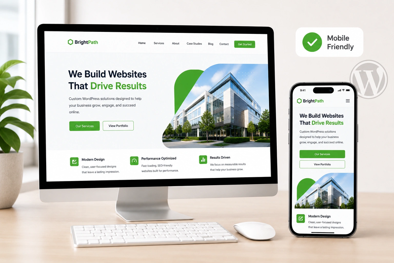
A mobile-friendly WordPress website adapts smoothly to any screen size. Text stays readable, images scale properly, navigation works with a finger, and pages load quickly without zooming or side-scrolling.
This is usually achieved through responsive design—layouts that use flexible grids and media queries. Most modern WordPress themes claim to be responsive, but “responsive” and “actually good on mobile” aren’t always the same thing.
I remember one client who came to me after their traffic dropped. Their theme looked fine on desktop, but on phones the menu covered half the screen and images were huge. We fixed it, and organic traffic recovered within weeks.
The Real Benefits: Better Experience, Rankings, and Results
Mobile users are impatient. If your site takes more than a few seconds to load or feels clunky, they bounce. Studies show that 74% of people are more likely to return to a site that works well on mobile.
For SEO, Google’s mobile-first indexing means the search engine primarily looks at your mobile version. If that version has missing content, slow speed, or poor usability, your rankings suffer across all devices.
Conversions take a hit too. Users are 67% more likely to buy when the site is optimized for mobile. On service sites like mine at Shihab Morshed, clear mobile navigation and fast forms make the difference between a lead and a lost visitor.
How Poor Mobile Experience Hurts Your Business
I once audited a WordPress website for a small business. Desktop looked professional, but on mobile the contact button was hidden, forms broke, and key sections required pinching and zooming. Their bounce rate was over 70% on phones.
That’s common. Slow or frustrating mobile experiences lead to lost sales, lower engagement, and damaged trust. In competitive niches, visitors simply choose a competitor whose site works better on their phone.
Step-by-Step: How to Make Your WordPress Website Mobile-Friendly
Here’s the exact process I use with clients:
- Test your current site. Visit your site on your phone or use Google’s Mobile-Friendly Test tool. Also check it in WordPress Customizer > Mobile preview.
- Choose or switch to a responsive theme. Look for themes tested on multiple devices. Popular options from the WordPress.org theme directory often include mobile previews.
- Optimize images and media. Use responsive images (srcset) and compress files. Plugins like Smush or ShortPixel help automatically.
- Simplify navigation. Make sure your menu collapses into a clean hamburger icon. Limit top-level items.
- Adjust typography and spacing. Increase font sizes for body text (at least 16px on mobile) and add breathing room with padding.
- Speed up your site. Enable caching, use a good host, and consider a CDN. Mobile users often have slower connections.
- Test forms and interactive elements. Make sure contact forms, buttons, and checkout processes work with touch.
After implementing these for a recent project at Digital Wind IT, load times dropped and mobile conversions rose noticeably.
Common Mistakes and How to Fix Them
Even experienced users make these errors:
- Using a non-responsive theme. Fix: Switch to one that is, or add custom CSS.
- Overloading with heavy plugins. They slow things down on mobile. Audit and deactivate what you don’t need.
- Ignoring touch targets. Buttons and links should be at least 48px apart.
- Different content on mobile vs desktop. Google prefers consistency. Keep content the same and just adjust layout.
- Forgetting to test on real devices. Emulators are helpful but not perfect—borrow a few phones or use BrowserStack.
Another frequent issue is pop-ups that cover the entire mobile screen. Keep them minimal or make them easy to dismiss.
Real-World Example from My Work
A local service business hired me to overhaul their WordPress website. Before changes, their mobile bounce rate was high and Google Search Console showed “mobile usability issues.”
We updated to a lightweight responsive theme, optimized images, and refined the layout. Within two months, organic traffic increased by over 40%, and phone calls through the site went up. The owner now sees most inquiries coming from mobile users.
FAQ About Mobile-Friendly WordPress Websites
Is every WordPress theme mobile-friendly?
No. Many older or poorly coded themes aren’t truly responsive. Always test before committing.
Does mobile-friendliness affect SEO?
Yes. With Google’s mobile-first indexing, a poor mobile experience can hurt your rankings significantly.
Can I make my existing site mobile-friendly without rebuilding?
Absolutely. Most changes involve theme settings, plugins, and some custom CSS. A WordPress developer can usually handle this quickly.
How do I check if my site is mobile-friendly?
Use Google’s Mobile-Friendly Test, run it on your phone, and check PageSpeed Insights for mobile scores.
What plugins help with mobile optimization?
Plugins like WP Touch, WPtouch, or caching tools (WP Rocket, LiteSpeed) can help, but start with a good responsive theme first.
How much does it cost to make a WordPress site mobile-friendly?
For most sites, it’s a few hundred dollars if hiring help. DIY is free if you’re comfortable with the Customizer.
Ready to Make Your WordPress Website Work Better on Mobile?
A mobile-friendly WordPress website isn’t optional anymore—it’s table stakes. It improves user experience, helps your SEO, and directly supports your business goals.
If you’ve been putting this off, start with the steps above. Test your site today and make one improvement.
Need help auditing or optimizing your site? Feel free to reach out—I’m happy to take a look. Visit Shihab Morshed or check our services at Digital Wind IT.