I’ve been building and optimizing websites for years, and one truth stands out: if your site doesn’t work flawlessly on every device, you’re already falling behind. Responsive web design isn’t just a nice feature anymore—it’s table stakes for staying visible and converting visitors in 2026.
Mobile traffic now makes up over 60% of web visits. Google uses mobile-first indexing, meaning it primarily looks at your mobile version when deciding rankings. A clunky desktop-only site loses visitors fast and hurts your SEO. In my work at Digital Wind IT, I’ve seen businesses transform their results after proper website redesign services that prioritize responsive web design.
This post shares practical insights from real projects. You’ll learn why a developer matters, how to approach it, common pitfalls, and steps to make your site competitive.
What Responsive Web Design Really Means (And Why DIY Often Falls Short)
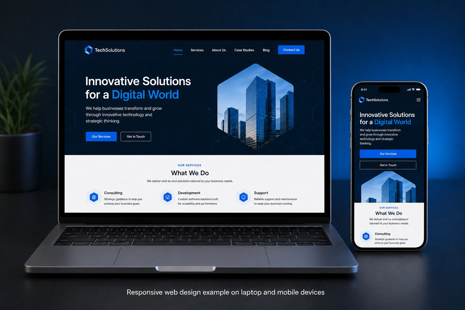
Responsive web design uses flexible layouts, images, and CSS media queries so your site automatically adjusts to any screen size—phone, tablet, desktop, or even future devices.
It’s not just shrinking text or stacking columns. Good responsive design considers touch targets, load times, navigation, and readability across devices.
I’ve reviewed many self-built sites using page builders. They often look okay on desktop but break on mobile: tiny buttons, horizontal scrolling, or images that don’t load properly. These issues drive up bounce rates and kill conversions.
Professional developers ensure clean code that performs well. According to recent data, responsive websites see 11% higher conversion rates and significantly better user engagement.
The Business Impact: Lost Sales, Poor Rankings, and Weak Brand Trust
Your website is often the first (and only) interaction customers have with your brand. If it frustrates them on mobile, they leave—73% of users cite non-responsive design as a main reason for bouncing.
I worked with a local service business whose old site looked great on desktop but was nearly unusable on phones. After a full responsive web design overhaul as part of website redesign services, their mobile conversions jumped noticeably within weeks. Traffic quality improved because Google rewarded the better experience.
Websites design company teams that understand both design and development also help with:
- Faster loading speeds (critical since users abandon slow sites)
- Better SEO through proper structure and mobile-first approach
- Consistent branding across devices
- Scalability as your business grows
Non-responsive sites fall behind competitors who invest in professional work. In competitive niches, that gap widens quickly.
Why You Need a Developer (Not Just Templates or Builders)
Page builders and templates help for simple sites, but they have limits when you want something that truly stands out and performs.
Developers bring:
- Custom code tailored to your needs instead of bloated templates
- Performance optimization that actually speeds up your site
- Security best practices and future-proof architecture
- Integration with tools like CRMs, booking systems, or e-commerce
I recommend checking official resources like WordPress.org for flexible foundations or Webflow for visual development with more control. But for most growing businesses, combining strategy with skilled development delivers the best results.
At my agency Digital Wind IT, we focus on practical solutions that balance beauty, speed, and functionality.
Step-by-Step: How to Get a Competitive Responsive Website
Here’s the process I typically follow with clients:
- Audit your current site — Test on real devices and tools like Google’s Mobile-Friendly Test. Note slow pages, broken elements, and user flow issues.
- Define goals and user journeys — What should visitors do? Buy, contact you, read content? Map mobile and desktop experiences.
- Choose the right platform — WordPress for content-heavy sites, custom code, or platforms like Shopify for stores. Consider long-term maintenance.
- Design with mobile-first — Start layouts for small screens and scale up. This aligns with Google’s approach.
- Build and optimize — Implement flexible grids, optimize images, test performance, and ensure accessibility.
- Test thoroughly — Use multiple devices, browsers, and real users. Check speed with PageSpeed Insights.
- Launch, monitor, and iterate — Track analytics and fix issues quickly.
This structured approach, handled by someone experienced, avoids costly mistakes.
Common Mistakes and How to Avoid Them
Even with good intentions, projects go sideways. Here are pitfalls I’ve seen (and fixed):
- Treating mobile as an afterthought: Always start mobile-first.
- Overloading with heavy elements: Fancy animations and huge images kill performance on phones.
- Ignoring core web vitals: Google cares about loading, interactivity, and visual stability.
- Using too many plugins: This bloats WordPress sites. A developer cleans this up.
- Skipping ongoing maintenance: Responsive sites still need updates for new devices and security.
One client came to me after a cheap redesign that broke after a WordPress update. Proper development includes documentation and support for smoother long-term ownership.
Real-World Example: From Frustrating to High-Converting
A coaching client approached me with a beautiful but rigid desktop site. Mobile users saw cramped text and hard-to-tap buttons. Bounce rate was high, and leads were low.
We delivered full website redesign services focused on responsive web design. We used clean code, optimized images, and improved navigation. Within two months, time on site increased, mobile conversions rose, and they ranked better for local searches.
The difference wasn’t just technical—it was understanding their audience and business goals.
FAQ: Responsive Web Design and Professional Help
How much does responsive web design cost?
It varies by complexity. Simple redesigns start lower, while custom solutions with advanced features cost more. Professional websites design company work is an investment that usually pays back through better performance.
Can I make my existing site responsive without a full redesign?
Sometimes yes, with targeted fixes. But for most older sites, a proper redesign is more efficient and delivers better results.
Does responsive design improve SEO?
Yes. Google favors mobile-friendly, fast sites. Mobile-first indexing makes this essential.
What’s the difference between a web designer and web developer?
Designers focus on visuals and UX. Developers turn those into functional code and optimize performance. The best projects combine both skills.
How often should I redesign my website?
Every 2–3 years or when major changes happen in your business or technology. Regular maintenance keeps it fresh in between.
Is a developer necessary if I use WordPress?
For basic sites, maybe not. For competitive performance, speed, and custom features, yes—especially as your business grows.
Ready to Make Your Website Work Harder?
Responsive web design isn’t a trend—it’s how modern websites succeed. It improves user experience, boosts conversions, and helps you compete in a mobile-first world.
If your site feels outdated or isn’t delivering results, professional website redesign services can change that. I’ve helped many businesses turn their online presence into a real asset.
Visit my site or Digital Wind IT to see examples and get in touch. Let’s build something that stands out and converts—consistently, on every device.
Your future customers (and search engines) will thank you.