Building a course site that feels welcoming and easy to use is key to keeping students engaged and reducing drop-offs. I’ve helped many creators set up their LearnWorlds academies, and the difference between a clunky site and a smooth one often comes down to thoughtful design choices—clear navigation, consistent branding, mobile optimization, and intuitive flow.
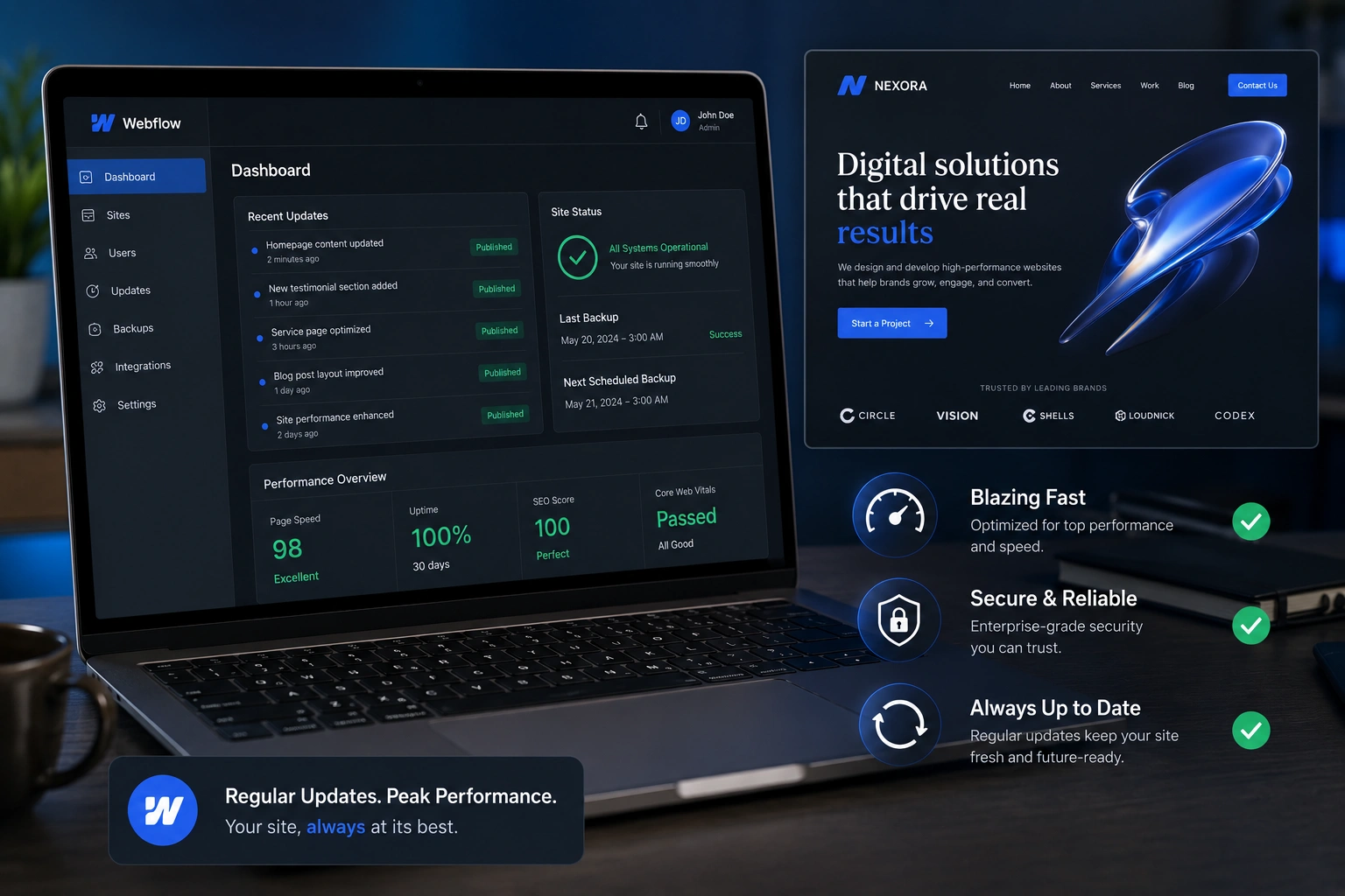
LearnWorlds makes this straightforward as an online class platform with its no-code Site Builder, 50+ industry templates, Theme Explorer for quick styling, and built-in tools for navigation and learner experience. You don’t need design skills to create something professional and user-friendly.
This guide walks you through the practical steps to build a site that students love navigating, based on what works best in real launches.
Why User-Friendly Design Matters on LearnWorlds
A confusing site leads to frustration—students bounce before enrolling or quit mid-course. Good UX means clear paths to courses, easy sign-up, logical menus, and fast loading.
LearnWorlds excels here: responsive templates, customizable players, dynamic navigation (different views for logged-in vs. guests), and features like communities for social feel. Creators who prioritize UX see higher completion rates and better reviews.
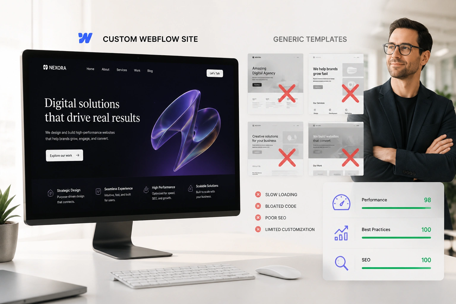
Choosing the Right Template for a User-Friendly Start
Start with a template that matches your niche—LearnWorlds has over 50 ready-made ones for coaching, fitness, business, creative skills, and more.
- Pick industry-specific ones: Coaching templates often have strong hero sections and testimonials; fitness ones emphasize visuals and schedules.
- Preview full sites: Check homepage, course catalog, about, and login flows.
- Focus on simplicity: Avoid overloaded designs—clean layouts with prominent CTAs convert better.
Templates give you a solid, mobile-ready foundation. Customize from there without starting blank.
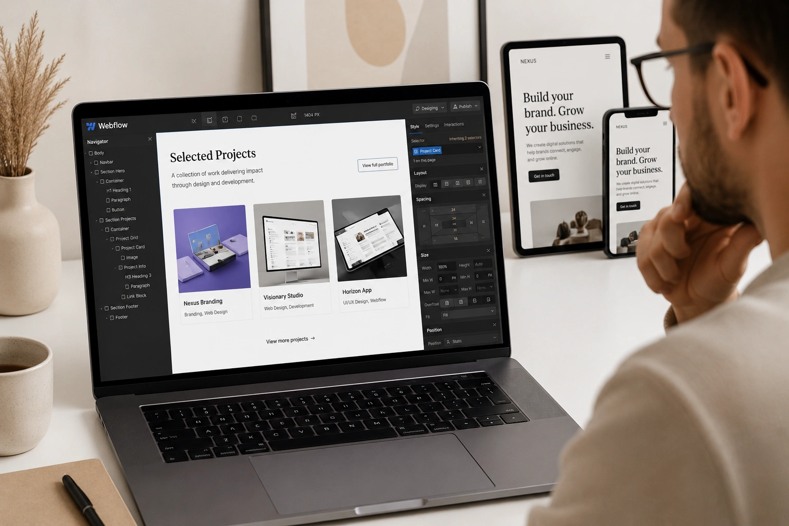
Customizing Your Site with Theme Explorer and Site Builder
Theme Explorer is your style hub—set consistent colors, fonts, buttons, and layouts site-wide in minutes.
- Go to Website > Theme Explorer: Choose presets or tweak individually (e.g., readable fonts like sans-serif, brand colors).
- Use Site Builder for pages: Drag-drop sections/widgets (course catalogs, testimonials, forms). Add global headers/footers for consistency.
Keep it simple: Limit fonts to 2-3, use plenty of white space, ensure high-contrast text, and add subtle animations sparingly.
Optimizing Navigation and Learner Flow
Navigation makes or breaks usability. LearnWorlds lets you control it deeply.
- Set main menus: Include Home, Courses, About, Blog, Contact—keep to 5-7 items.
- Dynamic views: Configure different after-login pages (e.g., dashboard for students).
- Course catalog: Use card widgets for easy browsing—show previews, prices, ratings.
- Course player: Choose free/sequential/prerequisite navigation based on your structure.
Test flows: Sign up as a student to ensure intuitive paths from homepage to enrollment to first lesson.
Step-by-Step: Building Your User-Friendly Course Site
- Sign up for free trial at LearnWorlds—select a template during onboarding.
- Customize basics: Settings > School Settings > upload logo/favicon, set custom domain.
- Style globally: Website > Theme Explorer > apply colors, typography, buttons.
- Edit key pages: Website > Design > Edit Website > update homepage hero, add course catalog section, testimonials, CTA buttons.
- Set navigation: Site Navigation settings—configure menus, after-login redirects, non-paying vs. paying user flows.
- Add course previews: Insert catalog widgets or custom course layout pages with benefits and enroll buttons.
- Optimize mobile: Preview on devices—adjust scaling, hide heavy elements if needed.
- Test learner journey: Create test account, enroll, navigate courses—fix pain points.
- Publish and monitor: Go live, then check analytics for drop-offs.
Most get a polished site in 1-2 days.
Real-World Example and Data Insight
A fitness coach I advised used a high-energy fitness template. She simplified the menu (Home, Programs, About, Blog), added prominent “Enroll Now” buttons, and used sequential navigation in courses for guided progress. Result: Student feedback praised the “easy to find everything” feel, and completion rates rose 35% compared to her previous basic setup.
Insight: LearnWorlds’ responsive templates and navigation options lead to better UX than rigid platforms—many creators report smoother student experiences because everything (site + player + community) feels connected.
Common Mistakes and Troubleshooting UX Issues
- Too many menu items — Overwhelms visitors. Fix: Prioritize top 5.
- Inconsistent styling — Looks unprofessional. Fix: Stick to Theme Explorer globals.
- Poor mobile experience — Most access via phones. Fix: Always preview/adjust.
- Hidden CTAs — Hard to enroll. Fix: Place buttons prominently.
- No testing — Assumptions fail. Fix: Run beta tests with 3-5 people.
- Ignoring accessibility — Small text/low contrast. Fix: Check readability tools.
Address early for best results.
Frequently Asked Questions
How beginner-friendly is the LearnWorlds Site Builder for user-friendly designs?
Very—drag-drop editor, presets, and templates make it intuitive; no coding needed.
What makes a LearnWorlds site user-friendly?
Clean navigation, consistent branding, mobile optimization, clear CTAs, and logical flow from homepage to course enrollment.
Can I customize navigation for different users?
Yes—set dynamic menus, after-login pages, and paying vs. non-paying views.
Which templates work best for user-friendly course sites?
Industry-specific ones with simple layouts, strong catalogs, and prominent enroll sections—preview to match your style.
How do I test the student experience on LearnWorlds?
Create a test account, enroll in a course, navigate as a learner—use Quick Start Guide 6 for checklists.
Where can I find official tips on LearnWorlds website design?
See their Quick Start Guide: LearnWorlds Quick Start Guide 3: Design Your Website.
Build a Course Site Students Love with LearnWorlds
Creating a user-friendly course site on LearnWorlds comes down to starting with a good template, applying consistent branding via Theme Explorer, simplifying navigation, and testing the full learner journey. The result is a professional academy that feels intuitive and trustworthy—helping you create course online and make online courses that retain students longer.
Start today: Pick a template in your trial and follow the steps above. Small tweaks lead to big improvements in satisfaction and sales.Need help refining your site or UX strategy? Check more tips athttps://shihabmorshed.com/. What’s one thing frustrating you about your current site setup? Share in the comments—I’ll suggest quick fixes.