I’ve spent years building and optimizing Webflow sites for clients around the world. One lesson stands out: a beautiful desktop design means nothing if it frustrates users on phones. Today, ignoring mobile responsiveness isn’t just a missed opportunity — it actively hurts your business.
As a Webflow expert, I’ve audited dozens of sites where the desktop version looked stunning but the mobile experience drove visitors away within seconds. In this post, I’ll share why mobile-friendly design matters more than ever, real data behind it, and exactly how to make your Webflow site perform on every device.
The Mobile Reality: Why Desktop-First Thinking Fails in 2026
Mobile devices now account for over 60% of global website traffic, with some eCommerce sites seeing 70% or more from phones. People browse, research, and buy on the go. If your site forces them to pinch, zoom, or scroll sideways, they leave.
Google has used mobile-first indexing for years. The search giant primarily crawls and ranks the mobile version of your site. A poor mobile experience directly impacts visibility.
I remember one client who came to me after their rankings dropped. Their Webflow site looked perfect on desktop, but on mobile, text was tiny, buttons were too close, and load times dragged. We fixed it, and organic traffic recovered within weeks.
Core Benefits of Mobile-Friendly Webflow Design
A responsive Webflow developer approach delivers clear wins:
- Lower bounce rates and higher engagement: Mobile-optimized sites see significantly lower bounce rates — often 27% or more improvement.
- Better conversion rates: Users are 23% more likely to convert on mobile-friendly sites.
- Faster load times: Webflow’s clean code helps, but proper mobile optimization (compressed images, efficient interactions) makes pages lightning-fast.
- Improved accessibility and UX: Larger touch targets, readable fonts, and intuitive navigation benefit everyone.
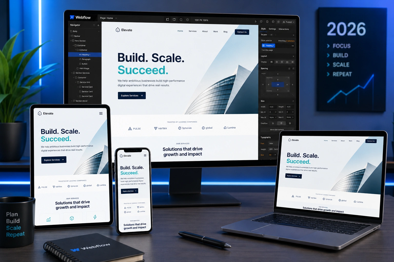
Webflow makes this easier than most platforms. Its visual breakpoints let you design intentionally for mobile portrait, landscape, tablet, and desktop without messy plugins.
How Mobile Optimization Impacts Business Results
For service-based businesses, freelancers, and agencies, mobile traffic often dominates lead generation. A clunky mobile site means lost inquiries.
In one project for a digital agency, we rebuilt their Webflow site with mobile-first principles. Form submissions increased by over 40% in the first month. Visitors could easily navigate services, read case studies, and contact the team on their phones.
Data insight: Sites with strong mobile experiences enjoy up to 35% more organic traffic on average. That’s real revenue on the line.
If you run an online course platform or membership site, platforms like Thinkific or Kajabi succeed partly because they prioritize seamless mobile experiences. Your Webflow site should match or exceed that standard.
Step-by-Step: Making Your Webflow Site Mobile-Friendly
Here’s the practical process I follow as a Webflow agency partner when optimizing sites:
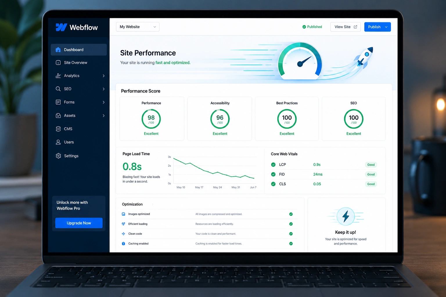
- Audit your current site: Use Webflow’s preview modes and Google’s Mobile-Friendly Test. Check load speed with PageSpeed Insights.
- Adopt mobile-first thinking: Start adjustments at the smallest breakpoint (mobile portrait) and scale up. This forces you to prioritize content.
- Set proper breakpoints: Webflow defaults work well — Mobile Portrait (480px), Mobile Landscape (767px), Tablet (991px), and Desktop. Customize only when needed.
- Use relative units and flexible layouts: Rely on percentages, ems, rems, and Webflow’s Flexbox/Grid. Avoid fixed pixel widths for containers and images.
- Optimize typography and touch targets: Ensure minimum 16px font sizes on mobile, at least 44px touch targets for buttons, and generous line spacing.
- Test relentlessly: Preview on real devices. Ask friends or use BrowserStack. Check forms, navigation, and interactions.
- Optimize performance: Compress images, use Webflow’s built-in optimization, and limit heavy interactions on mobile.
Follow these and your site will feel native on phones.
Common Mistakes and Troubleshooting in Webflow Responsive Design
Even experienced Webflow developers stumble here. Here are pitfalls I’ve fixed many times:
- Overusing fixed positioning or absolute elements — These break easily on smaller screens. Use them sparingly and test adjustments at every breakpoint.
- Ignoring hierarchy at mobile sizes — Content that stacks beautifully on desktop can create walls of text on mobile. Simplify layouts and increase white space.
- Forgetting to adjust interactions — Hover effects don’t work on touch. Provide tap alternatives.
- Image overflow — Always set max-width: 100% and height: auto.
- Slow mobile performance — Heavy animations or unoptimized CMS images kill experience. Prioritize above-the-fold content.
If something looks off at one breakpoint, check inherited styles from larger ones. Webflow’s class system is powerful but requires discipline.
For deeper dives into Webflow’s responsive tools, check the official Webflow University responsive design guide.
FAQ: Webflow Mobile-Friendly Sites
Do I need separate mobile and desktop versions in Webflow?
No. True responsive design uses one site that adapts. Webflow’s breakpoints handle this elegantly.
How does mobile-friendliness affect Webflow SEO?
Google prioritizes mobile versions. A fast, usable mobile site improves rankings, dwell time, and Core Web Vitals.
What’s the best way to test my Webflow site on mobile?
Use the Designer preview, Google’s testing tools, and real devices. Test across iOS and Android.
Can a Webflow expert fix an existing non-responsive site?
Absolutely. Most sites can be optimized without a full rebuild by adjusting layouts, typography, and performance at each breakpoint.
Is Webflow inherently better for responsive design than WordPress?
Webflow gives cleaner code and visual control over breakpoints. While WordPress can achieve great results, it often requires more plugins and custom work.
How long does it take to make a Webflow site mobile-friendly?
For a typical site, a few days of focused work. Complex custom interactions take longer but deliver big returns.
Ready to Build a Truly Mobile-First Webflow Site?
Mobile isn’t the future — it’s the present. As a Webflow expert and developer, I’ve watched clients transform their results by treating mobile as the primary experience.
Don’t let a great desktop design hide a poor mobile one. Your visitors — and Google — notice.
If you need help auditing or optimizing your Webflow project, visit my site or explore services at Digital Wind IT. Let’s create experiences that work beautifully for every user, on every device.