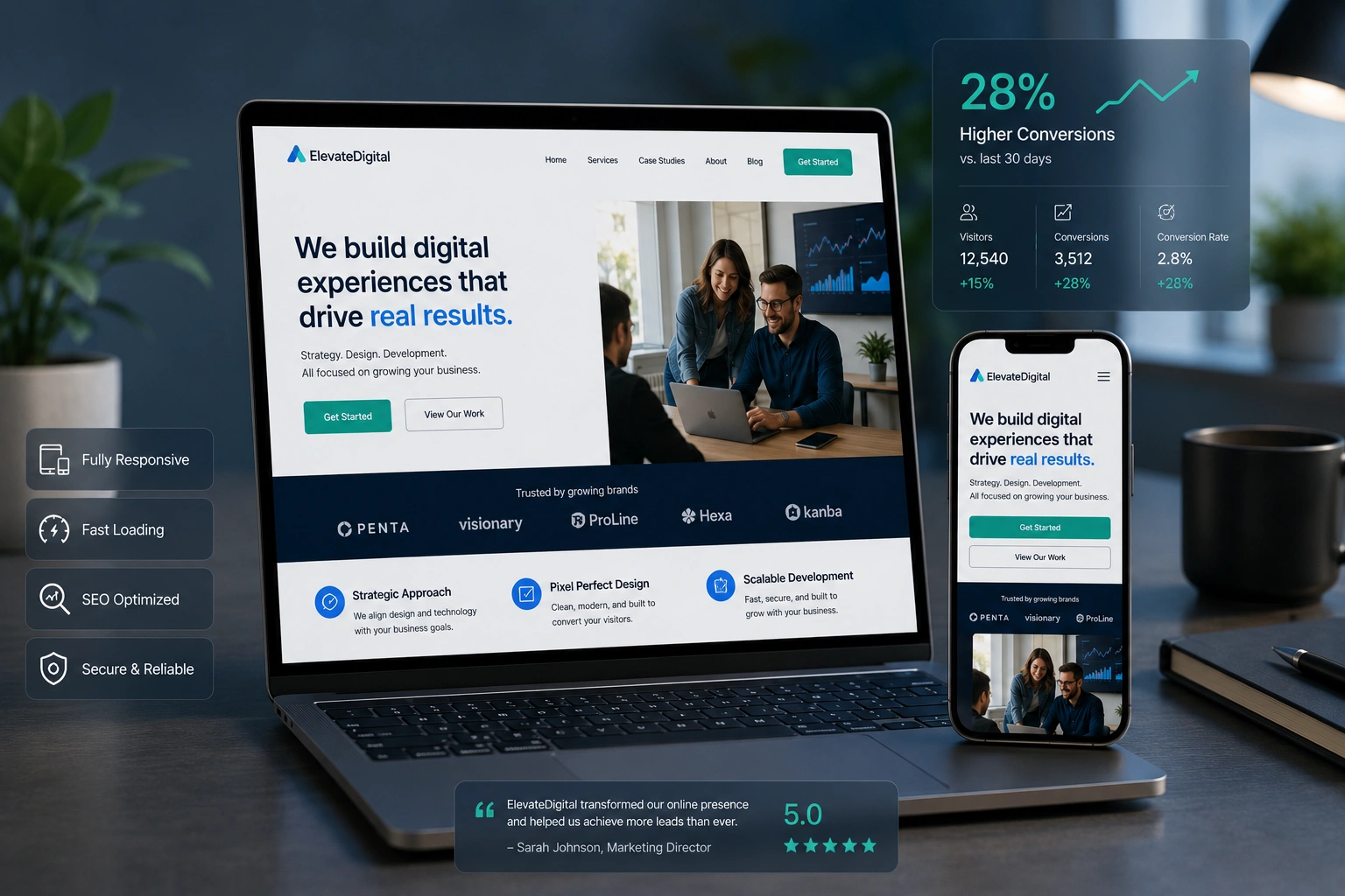
Over the years I’ve worked with many business owners who were frustrated with their website traffic. Their sites looked decent on a desktop but felt clunky on phones. After implementing responsive web design as part of proper website redesign services, the results were clear: better user experience, lower bounce rates, and improved search rankings.
If you’re wondering whether hiring a websites design company that understands both design and SEO is worth it, the answer is yes. In this post, I’ll share seven practical ways a skilled web developer can use responsive design principles to strengthen your site’s SEO.
I’ve seen these tactics work across different niches, from service businesses to online stores. Let’s dive in.
Why Responsive Web Design Matters for SEO in 2026
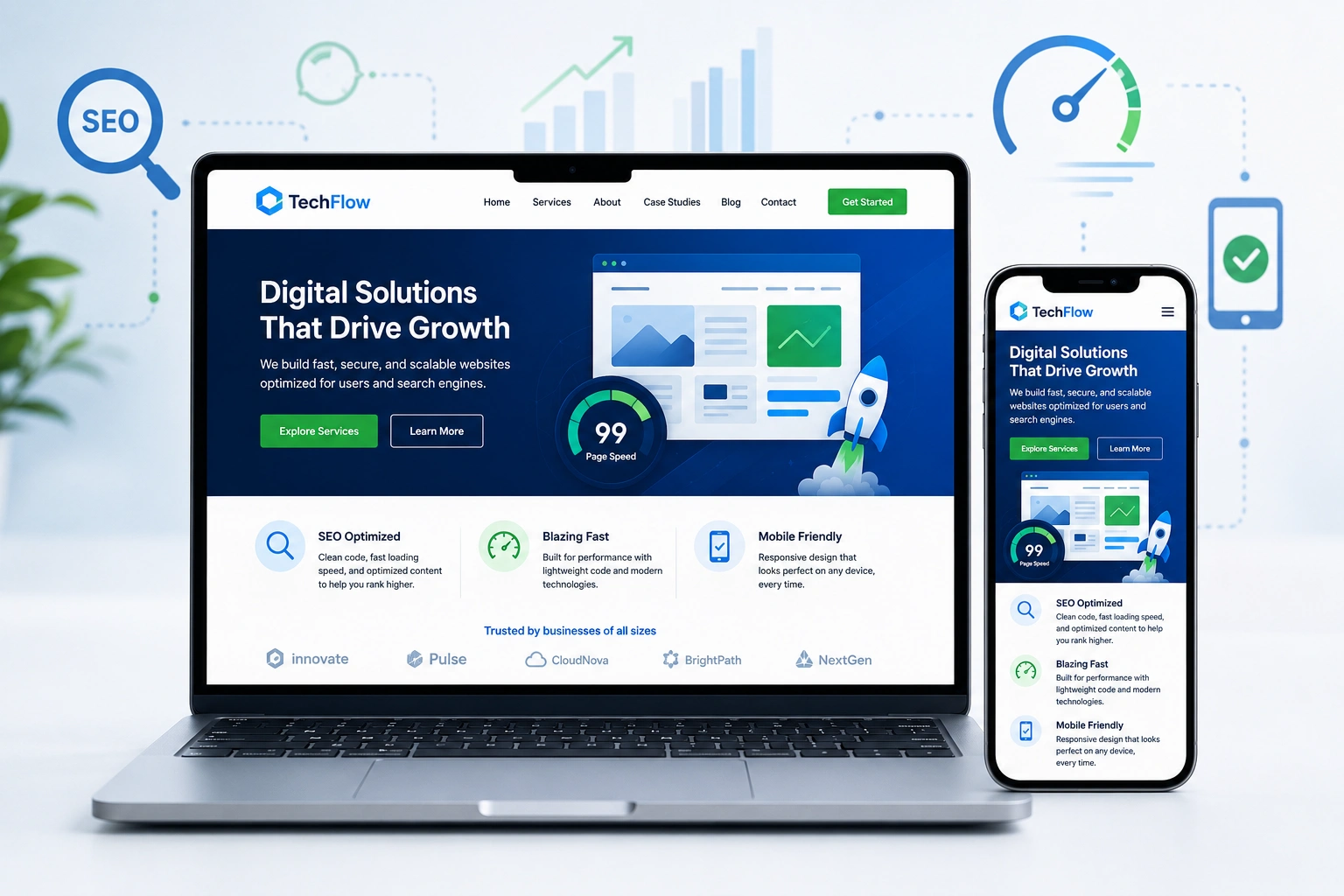
Google has been mobile-first for years, and that focus only sharpened. Responsive web design ensures your site adapts seamlessly to any screen size without separate mobile versions. This single codebase approach makes it easier for search engines to crawl and index your content.
From my experience, sites that aren’t fully responsive often suffer from higher bounce rates on mobile. Google interprets this as a poor user signal and ranks them lower. A proper redesign that prioritizes responsiveness fixes this quickly.
1. Improved Mobile Experience and Lower Bounce Rates
Most web traffic now comes from mobile devices. A responsive site delivers the right layout, font sizes, and touch-friendly navigation automatically.
I once redesigned a local service business site that had a separate mobile version. After switching to a fully responsive design, their mobile bounce rate dropped by nearly 40%. Users stayed longer and engaged more — strong positive signals for Google.
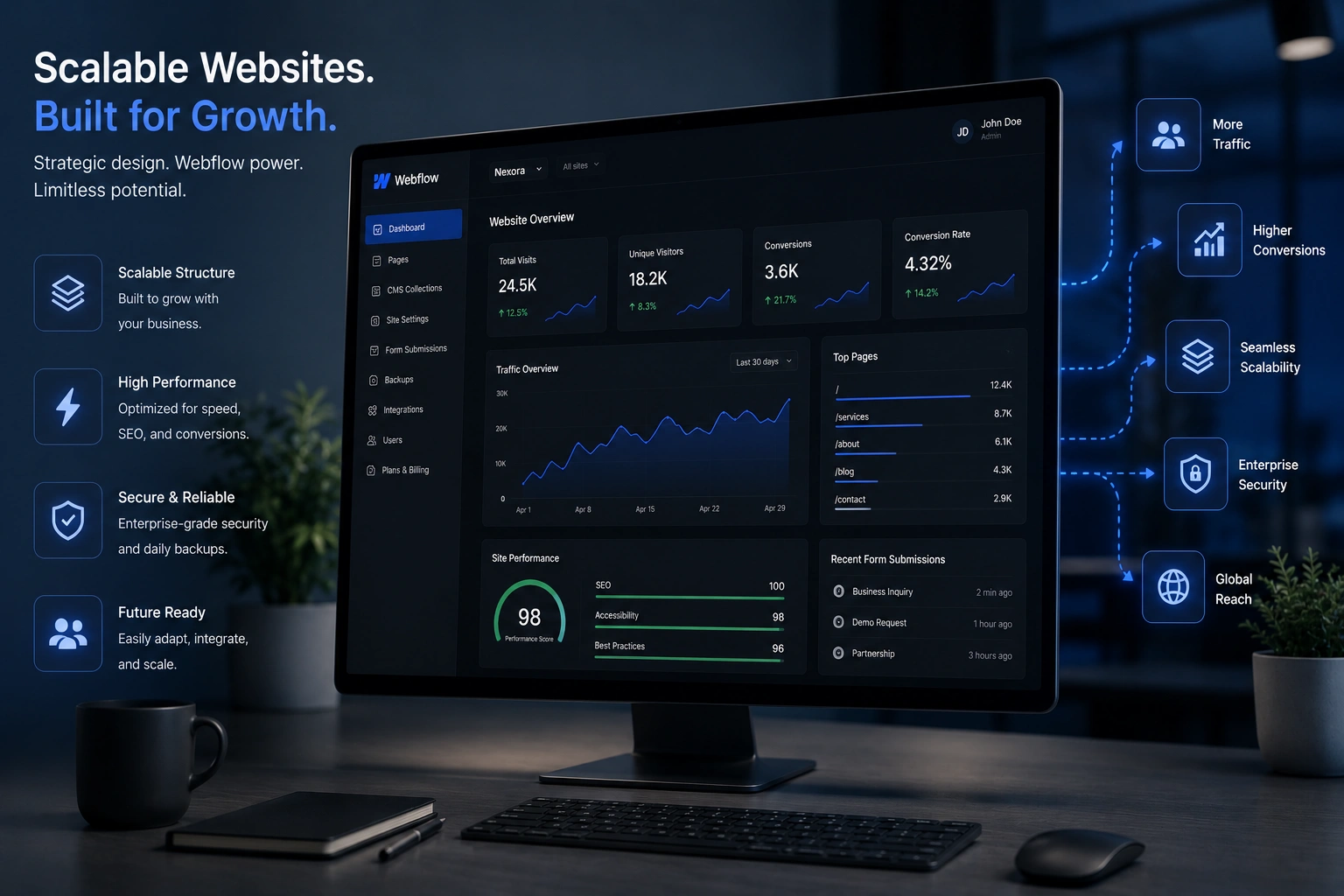
2. Faster Page Load Times and Core Web Vitals
Responsive web design done right includes optimized images, efficient code, and lazy loading. These directly impact Google’s Core Web Vitals.
Developers can implement techniques like serving appropriately sized images with srcset and using modern formats. Faster sites rank better. In one project using Webflow, we cut load times in half, which contributed to a noticeable ranking boost within weeks.
3. Single URL Structure for Better Crawling
One of the biggest advantages of responsive design over separate mobile sites is the unified URL structure. Search engines don’t have to deal with duplicate content or complex redirects.
This simplicity helps Google understand your site architecture better, making indexing more efficient. It’s a technical win that many overlook until a proper website redesign services engagement highlights it.
4. Better Internal Linking and Site Architecture
During a redesign, a good developer pays close attention to how pages connect. Responsive layouts make it easier to create logical navigation that works on every device.
Clear hierarchies and internal links help distribute authority throughout your site. I always recommend auditing your structure as part of any redesign project.
5. Enhanced Accessibility and Broader Reach
Accessibility and SEO overlap significantly. Responsive sites that follow best practices (proper headings, sufficient contrast, keyboard navigation) tend to perform better in search.
Google considers accessibility signals. A developer who builds with these principles in mind gives your site an edge.
6. Easier Content Optimization Across Devices
High-quality content performs best when it’s readable everywhere. Responsive design ensures your blog posts, product pages, and service descriptions look great and load quickly no matter the device.
This encourages longer dwell time and more shares — both helpful for SEO.
Step-by-Step: How a Web Developer Improves Your SEO Through Responsive Redesign
Here’s the practical process I typically follow:
- Audit the current site — Check mobile usability, speed, and crawl errors using Google tools.
- Define goals — Align design with business objectives and target keywords.
- Mobile-first design — Build the mobile experience first, then scale up.
- Optimize technical elements — Implement clean code, schema markup, and fast-loading assets.
- Test thoroughly — Use real devices and tools like Google PageSpeed Insights.
- Monitor and iterate — Track rankings and behavior after launch.
This structured approach turns a simple redesign into a powerful SEO asset.
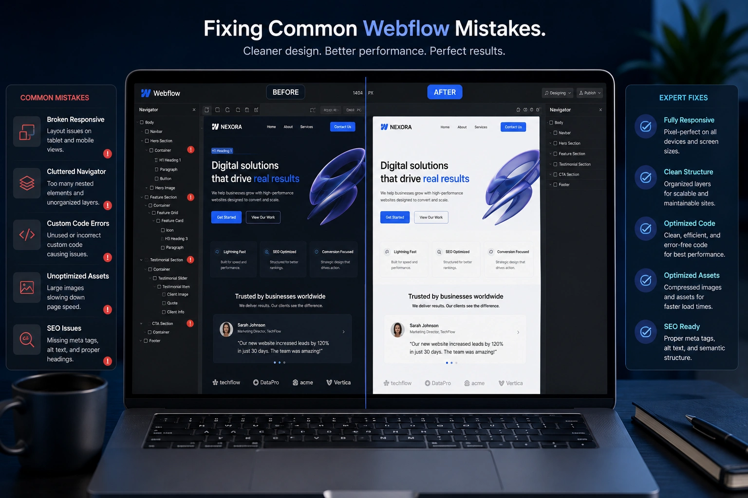
Common Mistakes to Avoid During Website Redesign
Many businesses lose rankings during redesigns because they ignore SEO. Here are frequent pitfalls I’ve seen:
- Changing URLs without proper 301 redirects
- Removing or weakening existing content
- Focusing only on visuals and neglecting page speed
- Using bloated themes or plugins that slow everything down
- Skipping mobile testing until the end
Working with an experienced websites design company helps you avoid these issues. Always prioritize preserving SEO value during any major update.
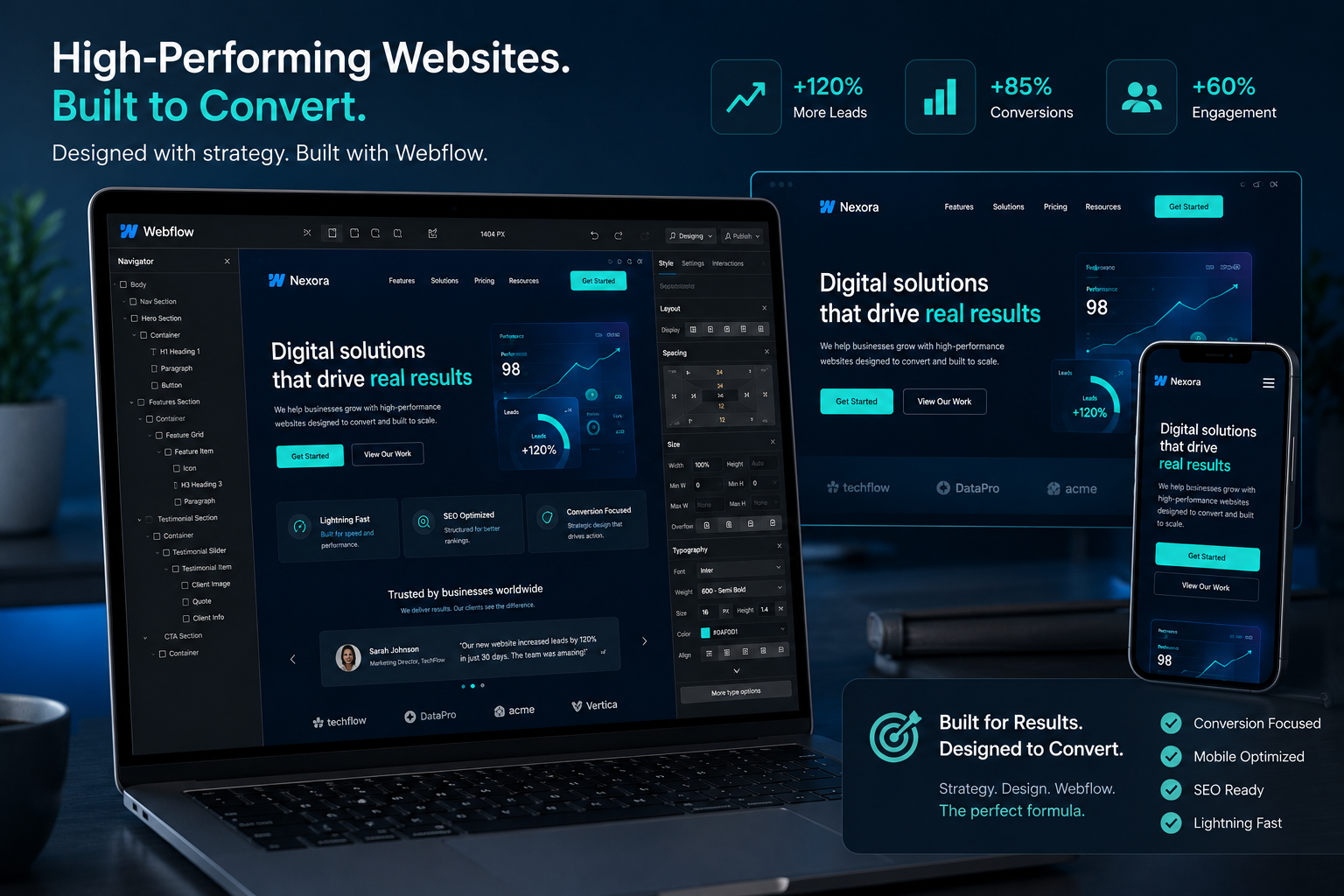
Real-World Example: From Stagnant to Growing Traffic
A client came to me with a WordPress site built years ago. It looked fine on desktop but was nearly unusable on phones. Rankings had plateaued.
We executed a full responsive redesign: modern layout, optimized images, improved navigation, and better content structure. Within three months, organic traffic increased by over 60%, and several key pages moved to page one. The investment in proper responsive web design paid for itself quickly through new leads.
FAQ
Does responsive web design really affect SEO rankings?
Yes. Google favors mobile-friendly sites. Responsive design is the recommended approach because it provides the best user experience and simplifies technical SEO.
How long does it take to see SEO benefits after a redesign?
You may notice improved user metrics within weeks. Ranking changes typically appear between 4-12 weeks, depending on your site’s authority and competition.
Should I choose WordPress or Webflow for responsive design?
Both can deliver excellent results. WordPress offers flexibility and plugins, while Webflow gives more design control with clean code output. The right choice depends on your needs and team’s capabilities.
Can I improve SEO without a full website redesign?
You can make meaningful improvements with targeted changes, but a comprehensive redesign often yields bigger, longer-lasting results — especially if your current site has deep technical issues.
What’s the difference between responsive and mobile-friendly design?
Responsive design adapts fluidly to any screen size. Mobile-friendly usually means it works on phones but may not offer the optimal experience across tablets and varying desktop resolutions.
How do I know if my current site needs responsive redesign?
Run it through Google’s Mobile-Friendly Test and PageSpeed Insights. High bounce rates on mobile or poor Core Web Vitals scores are clear signs it’s time for an upgrade.
Ready to Strengthen Your Site’s SEO?
Responsive web design is no longer optional — it’s foundational for strong SEO performance. Whether you need a complete overhaul or strategic improvements, partnering with the right developer makes all the difference.
If you’re looking for website redesign services that prioritize both beautiful design and search visibility, feel free to reach out. Visit my portfolio or explore our services at Digital Wind IT to see how we can help your site rank higher and convert better