I’ve spent years building and redesigning websites for clients ranging from solo entrepreneurs to growing online businesses. One lesson stands out: the right responsive web design approach doesn’t just look good on phones — it quietly saves months of headaches and thousands of dollars.
Most people start with a basic site that works okay on desktop. Then mobile traffic grows, complaints roll in, and suddenly they’re scrambling with separate mobile versions or painful redesigns. I’ve seen it too many times. A thoughtful responsive web design strategy, often delivered through expert website redesign services, changes that story completely.
In this post, I’ll share what I’ve learned from real projects about how hiring the right websites design company (or skilled developer) delivers measurable time and money savings.
What Responsive Web Design Actually Means (And Why It Matters)
Responsive web design is the practice of building websites that automatically adapt to any screen size — desktop, tablet, or phone — using flexible layouts, images, and media queries. One codebase serves everyone.
Back when I started, many businesses tried maintaining two or three separate sites. It was a nightmare. Updates had to be copied across versions. Bugs appeared differently on each device. Costs ballooned.
Today, responsive design is the standard, but doing it right still takes experience. Poor implementation leads to slow loading, broken layouts, or lost conversions. Done professionally, it becomes your most efficient asset.
How a Professional Web Developer Saves You Time
Time is the resource most business owners undervalue until it’s gone.
When you hire an experienced developer for responsive web design, you skip the trial-and-error phase that eats weeks. I’ve watched clients spend months tweaking free templates only to end up with sites that still break on certain phones.
A good developer handles:
- Proper mobile-first architecture from day one
- Optimized performance across devices
- Future-proof code that’s easy to maintain
Instead of you learning CSS media queries at 2 a.m., you focus on your actual business.
One client came to me after six months of DIY efforts on a platform that promised “no coding needed.” The site looked decent on desktop but was unusable on mobile. We rebuilt it with clean responsive web design principles in about three weeks — and it has needed almost zero maintenance since.
Real Cost Savings: The Numbers Don’t Lie
Building separate desktop and mobile sites can easily double your initial development cost and triple ongoing maintenance. With proper responsive web design, you maintain one site.
Studies and my own project data show clear advantages:
- Single codebase means updates happen once, not multiple times
- Faster load times reduce bounce rates dramatically
- Better user experience leads to higher conversions
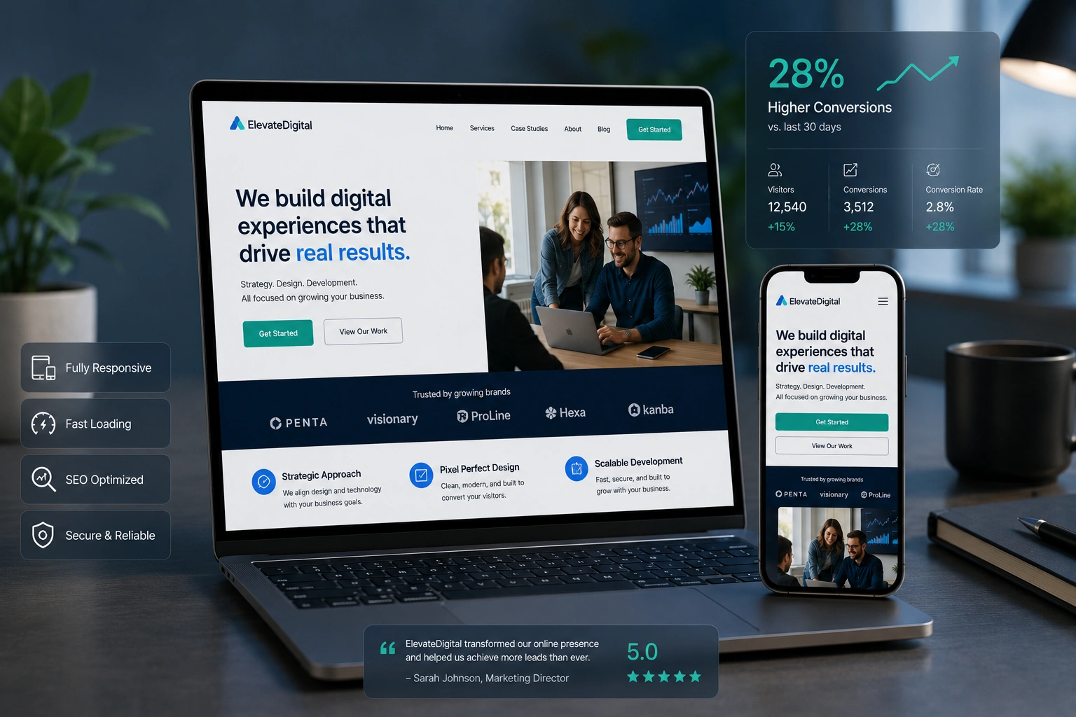
I’ve seen responsive sites improve conversion rates by noticeable margins compared to non-responsive ones. One e-commerce client saw their mobile sales jump after we redesigned their site. They no longer lost customers frustrated by zooming and pinching.
Hiring a websites design company also prevents expensive future overhauls. A well-built responsive site scales as your business grows, avoiding complete rebuilds that can cost tens of thousands.
Website Redesign Services: When and Why to Invest
Many businesses delay website redesign services until their old site is bleeding leads. That’s understandable — it feels like a big expense. But the real cost of a slow, non-responsive site is lost revenue and damaged reputation.
Signs it’s time for professional help:
- Your site looks broken on mobile
- Loading times exceed three seconds
- You’re struggling to add new features
- SEO performance has plateaued
Professional website redesign services from an experienced team deliver a site that works better immediately and stays maintainable long-term.
Step-by-Step: How We Approach Responsive Web Design Projects
Here’s my practical process that consistently delivers time and cost efficiency:
- Discovery & Audit — Review your current site, goals, target audience, and analytics. Identify pain points on different devices.
- Planning & Wireframing — Create mobile-first layouts that prioritize content and user flow.
- Design Phase — Develop visual concepts that reflect your brand while ensuring responsiveness.
- Development — Build with clean, semantic code. Test rigorously across real devices.
- Optimization & Launch — Compress images, minify code, set up proper hosting, and monitor performance.
- Training & Handover — Teach you (or your team) how to make simple updates without breaking the responsive layout.
This structured approach prevents the back-and-forth that inflates budgets on poorly managed projects.
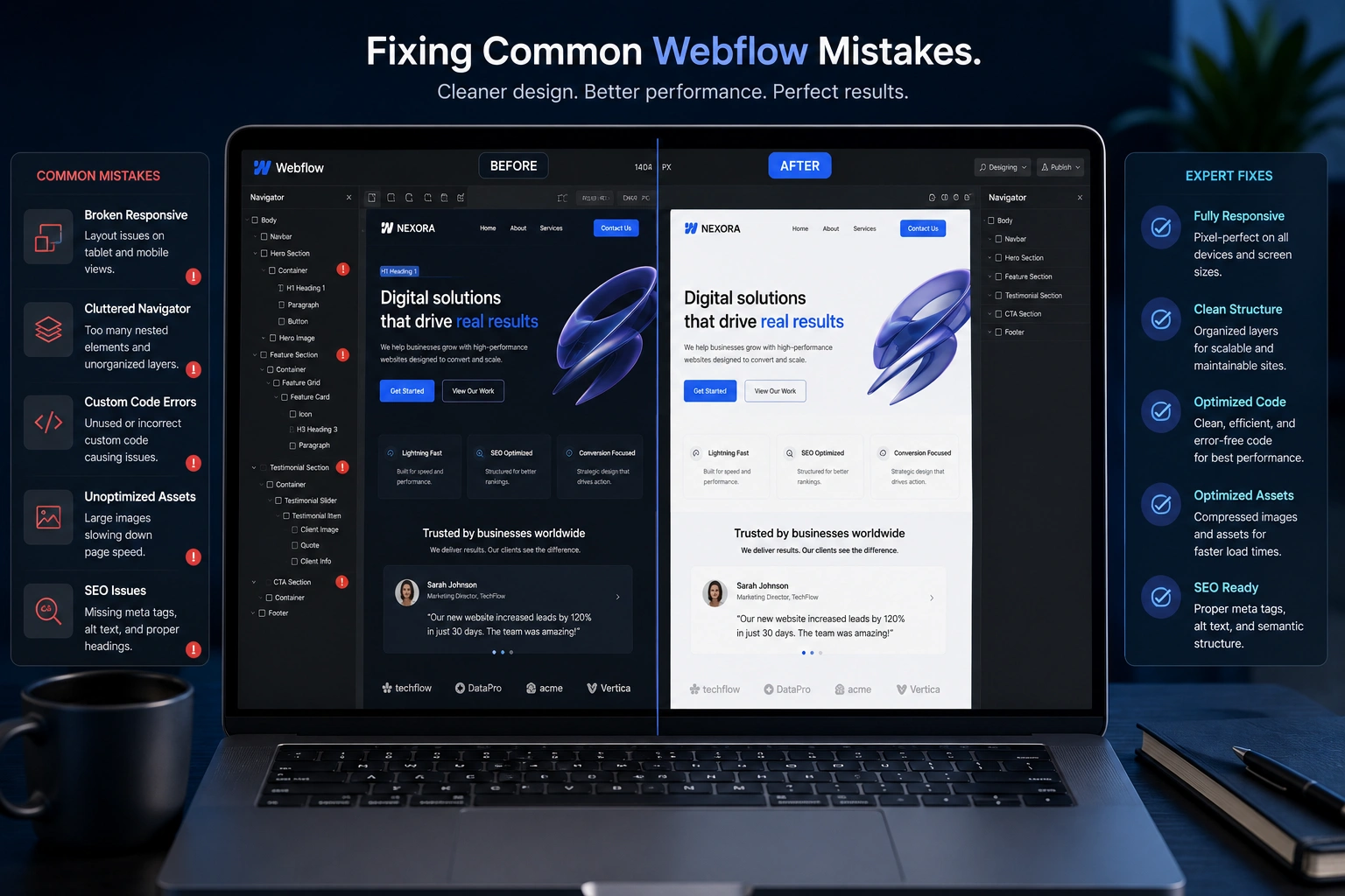
Common Mistakes That Waste Time and Money
I’ve fixed enough broken sites to spot the patterns:
- Ignoring mobile users — Building desktop-first and hoping it works on phones. This almost always requires expensive fixes later.
- Poor image optimization — Massive files that kill load times on mobile.
- Overly complex animations — They look cool but destroy performance across devices.
- Using outdated templates — Free themes that aren’t truly responsive or secure.
- DIY without proper testing — Assuming it looks good on your phone means it works everywhere (it doesn’t).
Another big one: choosing the wrong platform. While tools like WordPress.org offer great flexibility for responsive sites, they still need skilled implementation.
Real-World Example: From Frustrating to Profitable
A coach I worked with had a beautiful-looking site built on a popular page builder. On desktop it was fine, but on mobile the navigation hid content, forms broke, and images loaded slowly. She was losing potential clients daily.
We redesigned using solid responsive web design principles integrated with her existing content strategy. The new site loaded fast, looked professional everywhere, and included better calls-to-action.
Within two months, her inquiry rate increased significantly. More importantly, she stopped worrying about technical issues and focused on her programs. The investment paid for itself quickly through new business.
FAQ: Responsive Web Design and Professional Help
How much does responsive web design cost?
Costs vary widely depending on complexity, but expect to invest what reflects your business needs. The return usually comes through higher conversions and lower maintenance.
Can I make my existing site responsive without a full redesign?
Sometimes yes, through targeted website redesign services. However, for older sites, starting fresh often proves faster and cheaper long-term.
Is responsive design enough for good SEO?
It’s a critical foundation. Google favors mobile-friendly sites. Combine it with proper content, speed optimization, and structure for best results.
Should I use WordPress, Webflow, or Shopify?
It depends on your needs. WordPress.org offers flexibility, Shopify excels for e-commerce, and Webflow provides great design control. A skilled developer helps you choose and implement the right one responsively.
How long does a responsive redesign take?
Simple sites can launch in 3-6 weeks. Complex projects with custom features take longer but deliver more value.
What if I want to update the site myself later?
Professional developers build with maintainability in mind and provide training so you can handle content updates easily.
Ready to Stop Wasting Time and Money on Your Website?
Responsive web design isn’t just a technical feature — it’s a smart business decision that saves time, reduces costs, and helps you grow.
If your current site feels like a constant drain or you’re ready for something that actually works for your business, I’d love to talk. Visit my personal site or explore what we build at Digital Wind IT.