Over the past decade working with clients from small businesses to growing online platforms, I’ve seen one truth repeatedly: your website’s design isn’t just about looking good. It directly impacts how many visitors actually take action—whether that’s signing up, buying, or contacting you.
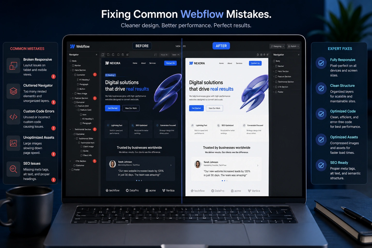
Responsive web design has become non-negotiable. When your site adapts seamlessly to phones, tablets, and desktops, visitors stay longer and convert more often. In my experience helping clients with website redesign services, implementing proper responsive techniques often delivers the quickest wins in conversion rates.
If your site feels clunky on mobile or loads slowly, you’re likely losing money every single day. This post breaks down exactly how a skilled web developer uses responsive web design and targeted improvements to turn more clicks into customers.
Why Responsive Web Design Matters More Than Ever
Mobile traffic now dominates for most sites. Yet many businesses still run on outdated designs that frustrate users on smaller screens.
Responsive web design uses flexible layouts, images, and media queries so your content looks and works perfectly regardless of device. No more pinching, zooming, or horizontal scrolling.
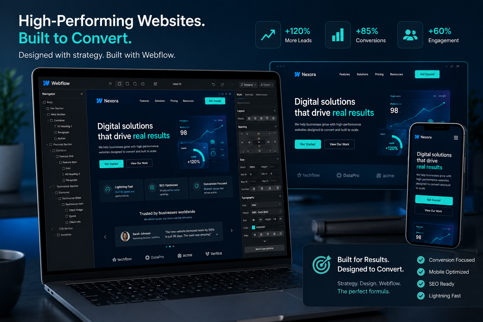
From what I’ve observed across dozens of projects, sites with strong responsive implementation see significantly better engagement. One study noted responsive websites can achieve 11% higher conversion rates overall, with mobile-optimized experiences showing even larger gains—sometimes up to 40% higher for mobile users.
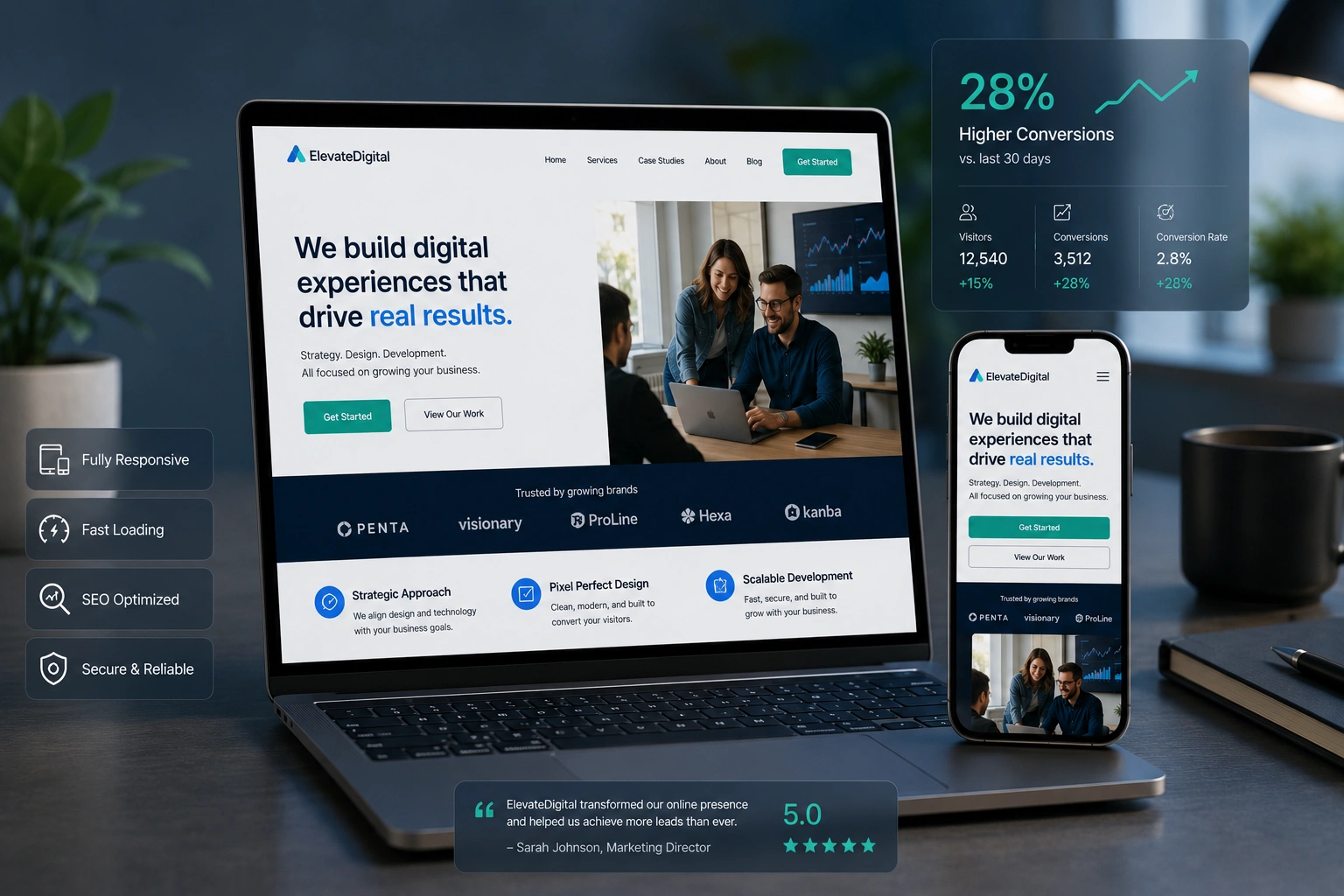
This isn’t theoretical. When I redesigned a client’s service site using modern responsive web design principles, their mobile bounce rate dropped sharply and form submissions increased noticeably within weeks.
The Business Impact: Conversions, Revenue, and Growth
Poor design kills conversions in subtle ways. Slow load times, broken layouts, or confusing navigation make visitors leave before they understand your offer.
A professional websites design company approach focuses on more than aesthetics. It prioritizes user experience (UX) that guides visitors naturally toward action. This includes fast loading, clear calls-to-action, logical information hierarchy, and trust-building elements.
Comparison insight: Traditional fixed-width designs often force mobile users into a frustrating experience. In contrast, modern responsive sites deliver consistent performance. Businesses that invest in proper redesigns frequently report higher average time on site, lower bounce rates, and better search rankings—since Google favors mobile-friendly experiences.
For online course creators or ecommerce stores, this matters even more. Platforms like Thinkific and Shopify thrive partly because they emphasize responsive, conversion-focused templates from the start.
Real-World Example: From Frustrating to Converting
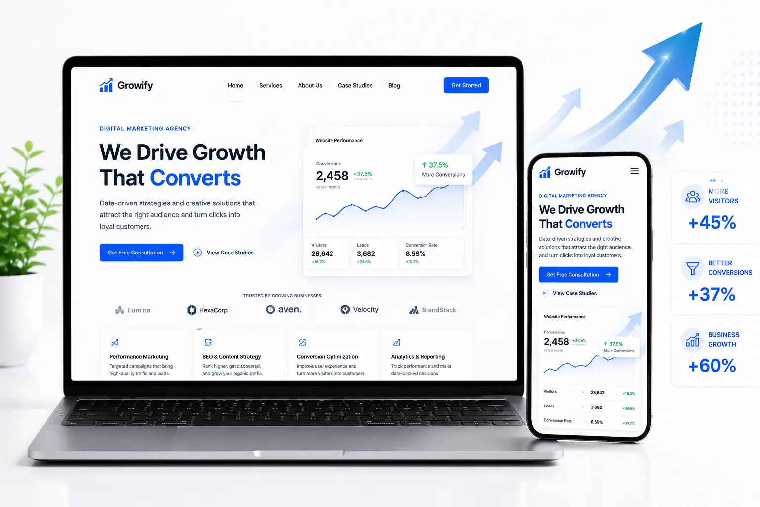
One client came to me with an older WordPress site for their consulting business. On desktop it looked decent, but on phones the menu was unusable, images overflowed, and key contact buttons were hard to tap.
After a targeted website redesign services project, we implemented a fully responsive layout, improved page speed, and refined the user journey. Results after three months:
- Mobile conversions up over 35%
- Overall leads increased by 28%
- Better Google visibility for local searches
The key wasn’t flashy animations—it was practical improvements that removed friction. This is the kind of outcome I aim for in every project.
Step-by-Step: How a Web Developer Improves Your Conversions
Here’s the practical process I typically follow when helping clients:
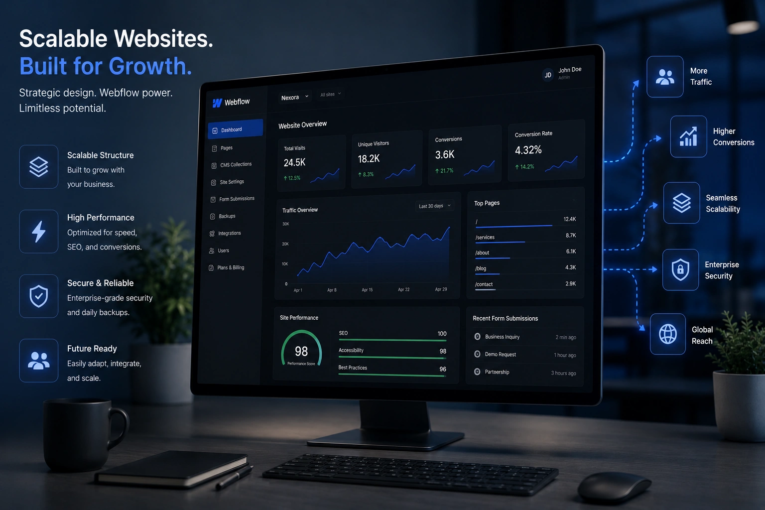
- Audit the current site — Analyze traffic data, heatmaps if available, and test across devices. Identify high-dropoff pages and usability issues.
- Implement responsive foundations — Use fluid grids, flexible images, and CSS media queries. Ensure it works on everything from small phones to large monitors.
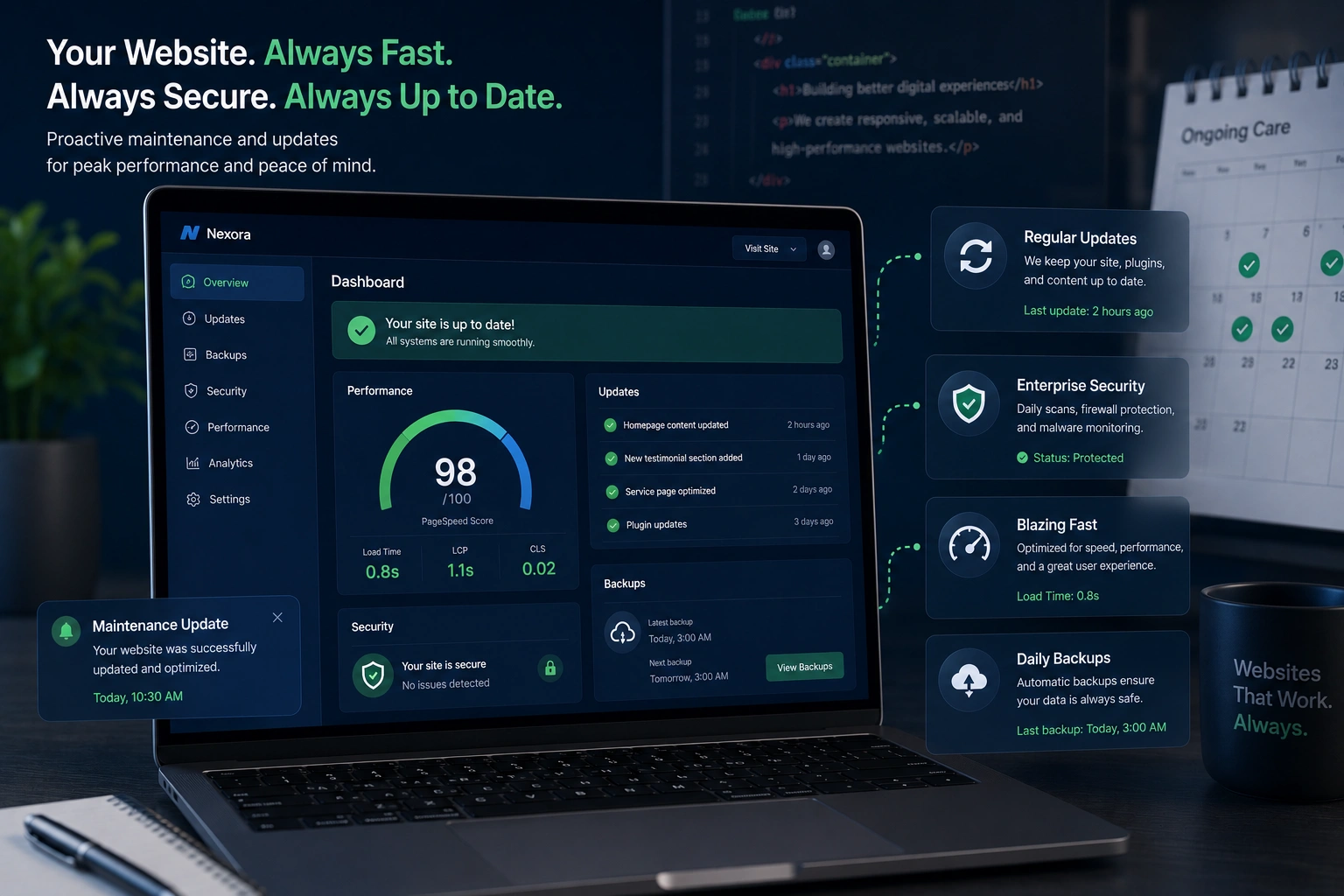
- Optimize performance — Compress images, minify code, enable caching, and choose lightweight frameworks. Every second of load time costs conversions.
- Refine user experience — Simplify navigation, create clear CTAs, improve content hierarchy, and add trust signals like testimonials.
- Test and iterate — Use A/B testing on key elements and monitor analytics after launch. Small tweaks often yield big results.
- Ongoing maintenance — Websites evolve. Regular updates keep performance and security strong.
This structured approach turns a basic site into a conversion machine.
Common Mistakes That Kill Conversions (And How to Fix Them)
Even experienced teams make these errors:
- Ignoring mobile users — Non-responsive designs frustrate the majority of visitors. Fix: Prioritize mobile-first design.
- Slow loading speeds — Users abandon slow sites instantly. Fix: Optimize images and code aggressively.
- Unclear calls-to-action — Vague buttons like “Learn More” perform worse than specific ones like “Get Your Free Audit.”
- Cluttered layouts — Too many elements overwhelm visitors. Fix: Embrace white space and focus on key messages.
- Poor accessibility — Not everyone browses the same way. Proper contrast and navigation help everyone (and improve SEO).
Avoiding these through proper responsive web design prevents lost opportunities.
I once fixed a site where the main CTA button was barely visible on mobile. Simply adjusting its size and placement boosted clicks significantly.
FAQ: Responsive Web Design and Conversions
What is responsive web design exactly?
It’s a development approach that makes your website automatically adjust its layout and content to provide an optimal viewing experience across all devices and screen sizes.
How much can responsive design actually improve conversions?
Results vary by industry, but many see 10-40% lifts, especially on mobile. The real value comes from combining it with strong UX and fast performance.
Do I need a full website redesign or just tweaks?
It depends on your current site. Older platforms often benefit from a full website redesign services project, while newer ones might need targeted responsive improvements.
Is WordPress good for responsive design?
Yes. With quality themes and proper development, WordPress.org sites can be highly responsive and conversion-focused.
How long does it take to see results after a redesign?
Technical improvements show quickly (within days or weeks). Full conversion gains often build over 1-3 months as traffic patterns adjust and search engines re-evaluate the site.
Should I hire a websites design company or use templates?
Templates work for simple needs, but for competitive conversion results, custom development tailored to your audience usually delivers better long-term ROI.
Ready to Turn Visitors Into Customers?
Responsive web design isn’t a nice-to-have—it’s essential for any site serious about growth. When done right, it creates smoother experiences that naturally lead to higher conversions.
Whether you’re running a service business, online store, or content site, investing in professional development pays off through more leads and sales.
If your site isn’t performing as well as it could, let’s talk. Check out my work and services at ShihabMorshed.com or explore more resources at DigitalWindIT.