I’ve built hundreds of websites over the years for coaches, e-commerce stores, and service businesses. One thing I see repeatedly? Sites that look fantastic on a desktop but become frustrating messes on a phone. In today’s world, that’s a fast way to lose customers.
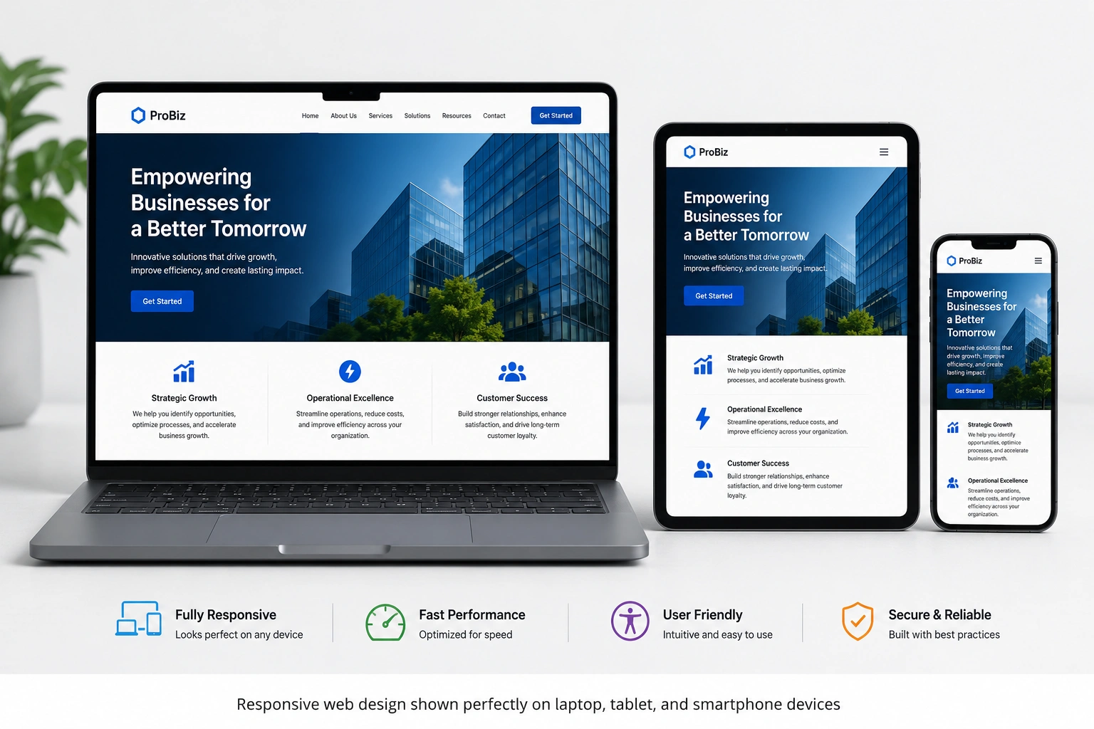
Responsive web design solves this by making your website automatically adapt to any screen size—desktop, tablet, or mobile—without losing functionality or beauty. If you’re running a business online, ignoring this is no longer an option.
In this post, I’ll share why responsive web design matters more than ever, real data behind it, and exactly how to make it work for you. Whether you’re considering website redesign services or working with a websites design company, you’ll walk away with clear, actionable insights.
What Is Responsive Web Design and Why Does It Matter Now?
Responsive web design uses flexible layouts, images, and media queries so your site rearranges itself based on the device. It’s not just about shrinking text—it’s about creating an intentional experience everywhere.
Mobile traffic now dominates. Over 60% of web traffic comes from mobile devices, and that number keeps climbing. Users expect fast, easy navigation whether they’re on a phone during commute or a laptop at home.
From my work with clients on platforms like WordPress and Webflow, I’ve seen firsthand how a non-responsive site kills momentum. Visitors bounce quickly, and Google notices.
The Business Benefits: Conversions, SEO, and User Trust
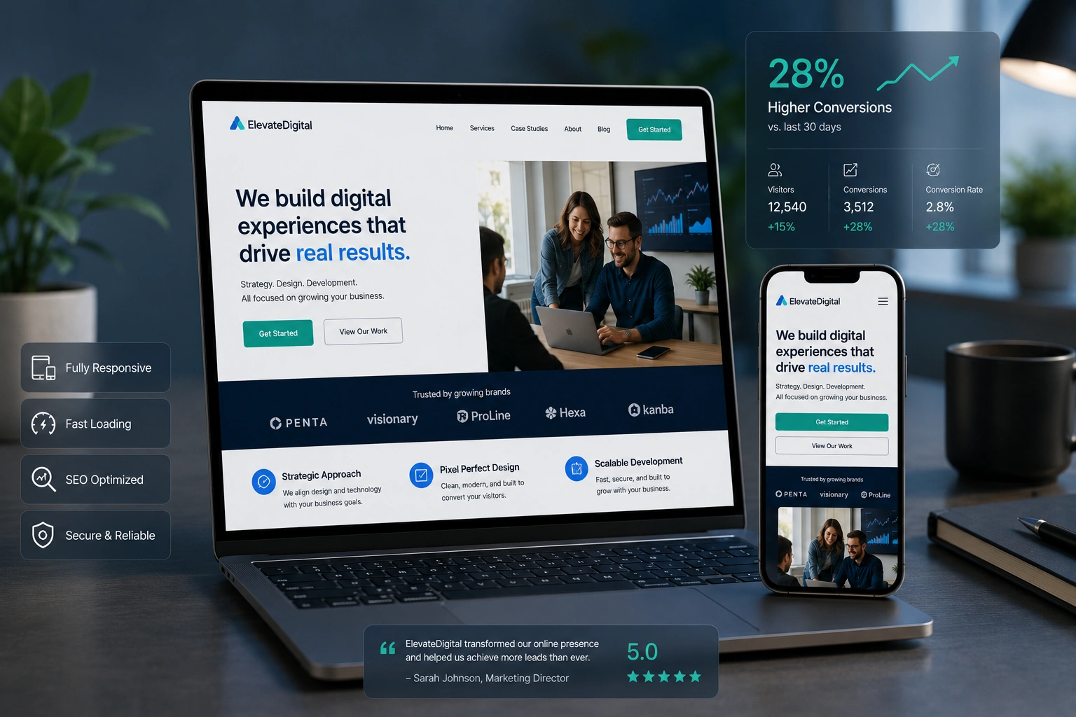
The numbers don’t lie. Responsive websites see about 11% higher conversion rates on average. Some businesses report up to 62% sales increases after going responsive.
Think about it: a potential customer finds you on Google via their phone. If your site forces them to pinch and zoom, or buttons are too small to tap, they leave—often within seconds. Studies show 73% of users cite poor responsiveness as a top reason for abandoning a site.
Mobile optimization also helps SEO. Google uses mobile-first indexing, meaning it primarily looks at your mobile version when ranking. A responsive site performs better in search results and loads faster, which reduces bounce rates.
Beyond metrics, it builds trust. A polished, mobile-friendly experience tells visitors you care about their time. In my projects, clients often see longer session times and more inquiries once we make the switch.
Real-World Example: Transforming an Online Course Platform
One of my recent clients ran an online learning business. Their original site looked great on desktop but broke on mobile—course previews overlapped, navigation hid key sections, and checkout felt clunky.
We implemented a full responsive web design overhaul using Webflow. The result? Mobile bounce rate dropped significantly, course enrollments rose, and students reported a much smoother experience. What used to frustrate users on phones now felt intuitive.
This isn’t unique. Whether you sell physical products on Shopify or services through a custom site, responsive design directly impacts your bottom line.
Step-by-Step Guide to Implementing Responsive Web Design
Here’s how I approach it with clients when delivering website redesign services:
- Audit Your Current Site – Test on multiple devices using tools like Google’s Mobile-Friendly Test. Note pain points like slow loading or broken layouts.
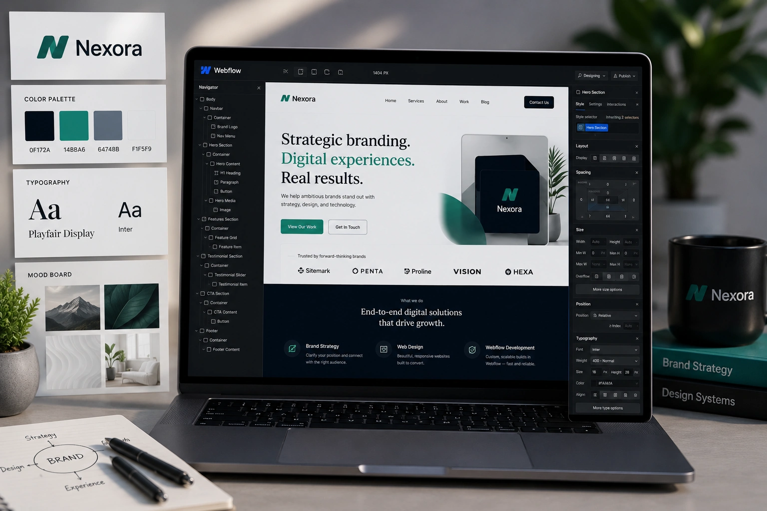
- Choose the Right Platform – WordPress with a responsive theme, Webflow for custom control, or Shopify for stores all support responsive design out of the box. Check WordPress.org for excellent starting themes.
- Design Mobile-First – Start layouts for the smallest screen, then scale up. Prioritize key content above the fold.
- Optimize Images and Speed – Use responsive images that serve appropriate sizes. Compress where possible.
- Test Thoroughly – Check across real devices and browsers. Ensure forms, menus, and CTAs work perfectly on touchscreens.
- Monitor and Iterate – Use analytics to see how users behave post-launch and make adjustments.
Working with an experienced websites design company can speed this up and avoid common pitfalls.
Common Mistakes and How to Avoid Them
Even experienced teams get these wrong:
- Desktop-First Approach: Designing only for large screens then hoping it works on mobile. Always start mobile-first.
- Ignoring Touch Elements: Buttons too small or too close together frustrate mobile users.
- Heavy Media: Large images that don’t resize properly slow everything down.
- Inconsistent Navigation: Hamburger menus that hide important links or complex dropdowns that don’t work well on phones.
In one project, a client’s site had beautiful desktop animations that caused mobile lag. We simplified and saw immediate performance gains.
If your current site has these issues, professional website redesign services can fix them efficiently.
Responsive Web Design FAQ
What is responsive web design exactly?
It’s a development approach where your website layout, images, and content fluidly adjust to provide an optimal viewing experience on any device.
Does responsive design improve SEO?
Yes. Google favors mobile-friendly sites, and responsive design supports faster loading and better user signals that influence rankings.
How much does a responsive redesign cost?
It varies by complexity, but for most small to medium businesses, professional website redesign services deliver strong ROI through increased conversions and retention.
Can I make my existing WordPress site responsive?
Absolutely. Many themes are responsive by default, and plugins or custom work can upgrade older sites.
Is responsive design enough, or do I need more?
It’s the foundation. Combine it with fast hosting, clear content, and strong calls-to-action for best results.
How do I know if my site is truly responsive?
Test it yourself on different devices or use free tools. Better yet, have an expert review it.
Why Investing in Responsive Web Design Pays Off
After years of helping businesses through website redesign services, I’m convinced: responsive web design isn’t a nice-to-have—it’s essential for staying competitive. It improves user experience, boosts conversions, strengthens SEO, and shows customers you respect their time.
Don’t let a poor mobile experience cost you sales. Whether you need a full build or targeted improvements, the right approach makes all the difference.
Ready to make your site work beautifully everywhere? Visit my services at Shihab Morshed or explore Digital Wind IT solutions. Let’s build a website that grows with your business.