I’ve been building and redesigning websites for years, and one thing hasn’t changed: if your site doesn’t work well on a phone, you’re leaving money on the table. Responsive web design isn’t a nice-to-have anymore—it’s table stakes in 2026.
More than half of all web traffic now comes from mobile devices. People browse on their phones while commuting, waiting in line, or relaxing at home. If your website looks broken or loads slowly on mobile, visitors bounce before they even see what you offer.
In this post, I’ll walk you through exactly why your business needs a mobile-friendly website, the real impact on growth, and how to get it done right. Whether you’re considering website redesign services or working with a websites design company, you’ll leave with clear, actionable steps.
What Is Responsive Web Design and Why Does It Matter Now?
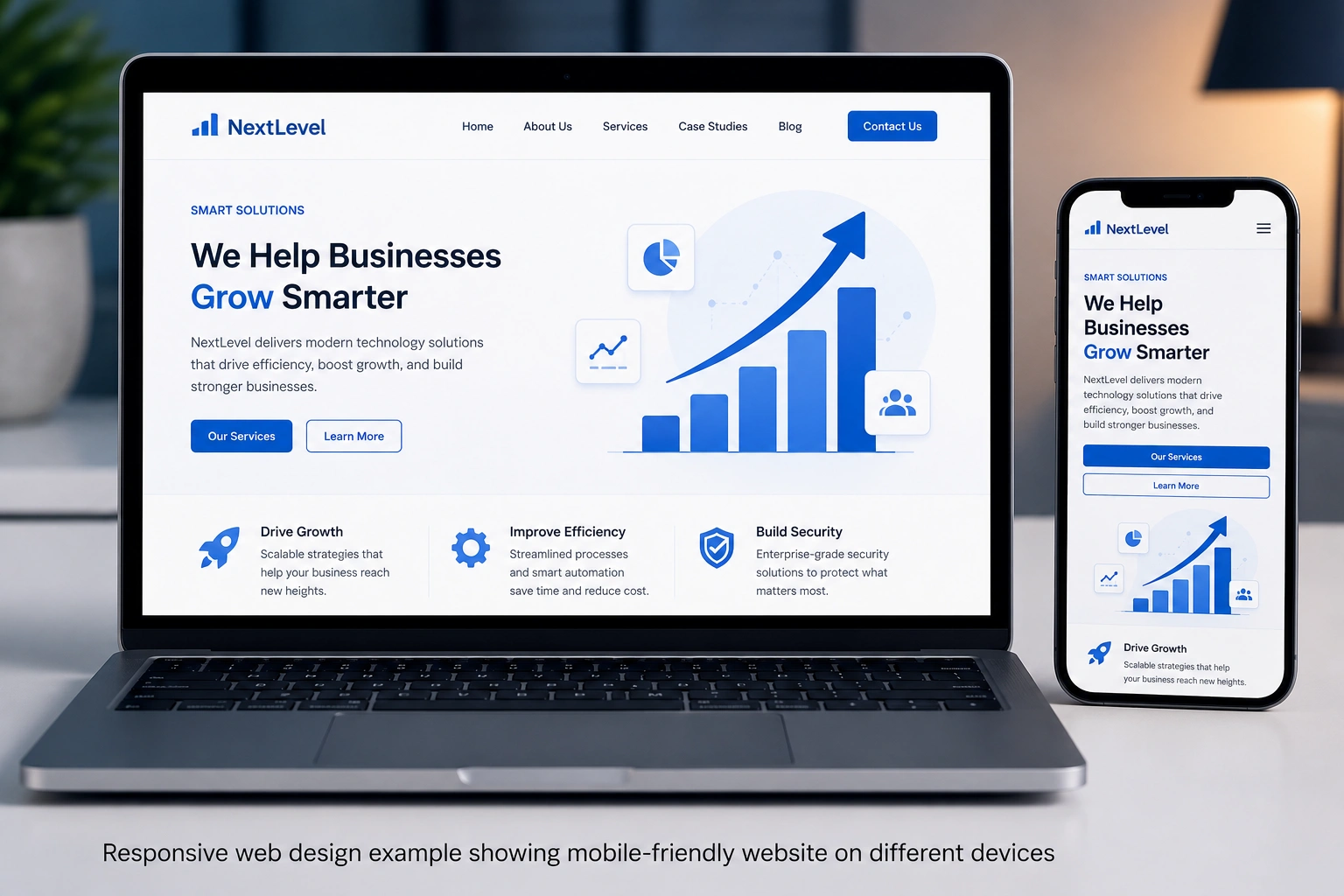
Responsive web design uses flexible layouts, images, and CSS media queries so your site automatically adjusts to any screen size—phone, tablet, desktop, or even a smartwatch. One codebase serves everyone.
I learned this the hard way early in my career. A client’s beautiful desktop site looked terrible on phones. Navigation was hidden, text too small, buttons impossible to tap. Their bounce rate was sky high. After a proper responsive redesign, traffic and leads improved dramatically.
Google has been mobile-first for years. They primarily crawl and rank the mobile version of your site. If that version is poor, your entire SEO suffers.
The Business Impact of a Mobile-Friendly Website
The numbers don’t lie. Mobile-optimized sites see higher conversion rates—often 20-40% better—and much lower bounce rates.
Think about it: someone finds you on Google while on their phone. They tap your link expecting quick answers. If your site forces them to pinch and zoom or wait for slow images, they’re gone—probably to a competitor.
For e-commerce or service businesses, this is critical. A smooth mobile-friendly website builds trust instantly. It shows you care about your customers’ experience.
I’ve seen local businesses double their inquiry rates after focusing on responsive design. One client, a small consulting firm, went from losing half their mobile visitors to converting more leads on phones than desktop.
How Responsive Web Design Improves SEO and User Experience
Search engines love fast, usable sites. Responsive web design helps because:
- Google prioritizes mobile performance in rankings.
- You avoid duplicate content issues from separate mobile sites.
- Faster load times and better Core Web Vitals boost your scores.
Beyond SEO, the user experience wins. People stay longer, read more, and take action when navigation is intuitive and content readable.
Platforms like WordPress.org make this easier with responsive themes, while tools like Webflow give designers precise control without coding everything from scratch.
Step-by-Step: How to Make Your Website Mobile-Friendly
Here’s the practical process I use with clients:
- Audit Your Current Site Use Google’s Mobile-Friendly Test tool. Check load speed with PageSpeed Insights. Note pain points like tiny text or overlapping elements.
- Choose the Right Approach For most businesses, I recommend a full website redesign services package rather than patching. Modern frameworks make responsive web design standard.
- Focus on Key Elements
- Flexible grid layouts
- Scalable images (use srcset)
- Touch-friendly buttons (at least 44px)
- Readable fonts and proper spacing
- Fast-loading optimized media
- Test Across Devices Real devices beat emulators. Test on different phones, screen sizes, and even orientations.
- Monitor and Iterate After launch, use analytics to see how mobile users behave. Fix issues quickly.
If you’re not technical, working with a reliable websites design company saves time and avoids costly mistakes.
Common Mistakes and Troubleshooting Mobile Issues
Even experienced teams slip up. Here are pitfalls I see often:
- Ignoring Touch Targets — Links too close together frustrate users.
- Heavy Images — Compress and serve next-gen formats like WebP.
- Popup Overload — Mobile popups that cover the screen kill experience.
- Fixed Desktop-Only Elements — Sidebars that don’t collapse properly.
- Slow Third-Party Scripts — Analytics or chat widgets that drag performance.
Troubleshooting tip: If your site feels slow on mobile, start by checking image sizes and render-blocking resources. Tools like GTmetrix show exactly what’s holding you back.
Another mistake is assuming “it looks okay on my phone” means it’s good. Different devices and network conditions reveal problems.
Real-World Example: From Frustrating to Converting
One of my clients ran a coaching business. Their old site was built years ago and barely worked on phones. Visitors on mobile couldn’t easily book calls or read testimonials.
We implemented clean responsive web design using modern techniques. Navigation became a simple hamburger menu, content stacked logically, and load time dropped significantly.
Result? Mobile traffic converted at nearly the same rate as desktop, overall leads increased by over 60% in three months, and their Google rankings improved for key service pages. They no longer worried about losing customers who discovered them on the go.
FAQ: Responsive Web Design Questions Answered
Is responsive design the same as mobile-friendly?
Yes, essentially. Responsive design is the technical approach that makes your site mobile-friendly across all devices.
How much does a responsive redesign cost?
It varies by complexity, but good website redesign services deliver strong ROI through better conversions and traffic.
Can I make my existing site responsive without a full redesign?
Sometimes, with adjustments. But for best results and future-proofing, a proper redesign is usually smarter.
Does responsive design affect my SEO?
Absolutely—it helps. Google favors mobile-optimized sites in mobile-first indexing.
How do I know if my site is already responsive?
Resize your browser window or use Google’s mobile test. Better yet, ask real users or check analytics for mobile bounce rates.
What’s the best platform for responsive websites?
Depends on needs. WordPress powers many flexible sites, while Webflow offers advanced design control without heavy coding.
Ready to Future-Proof Your Website?
Responsive web design isn’t just about looking good on phones—it’s about staying competitive, improving user experience, and growing your business in a mobile-first world.
If your site feels outdated or you’re losing visitors on mobile, it’s time for action. Whether you need full website redesign services or expert guidance, I help businesses create fast, beautiful, high-converting websites.
Check out my work and services at Shihab Morshed or explore more digital solutions at Digital Wind IT.
Don’t wait until your competitors pull ahead. Make your website work for every visitor, on every device. Reach out today and let’s build something that grows with your business.