I’ve spent years helping businesses move from clunky, outdated sites to ones that actually work for them. The difference isn’t just visual — it’s measurable in traffic, leads, and revenue. If your website feels stuck in 2015, responsive web design might be the single biggest upgrade you can make.
In this post, I’ll walk you through exactly how a custom approach to responsive web design, smart website redesign services, and working with the right websites design company can completely transform your brand’s online presence. No fluff — just real strategies I’ve seen deliver results.
What Responsive Web Design Really Means (And Why It Matters Now)
Responsive web design isn’t just about shrinking your desktop site to fit a phone. It’s about creating an experience that adapts perfectly to every device — phone, tablet, laptop, or even large desktop monitors.
Google has been mobile-first for years. If your site loads slowly or looks broken on mobile, you’re losing visitors before they even read your first sentence. I’ve audited dozens of sites where bounce rates dropped 30-50% after a proper responsive redesign.
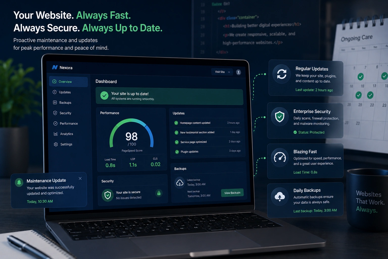
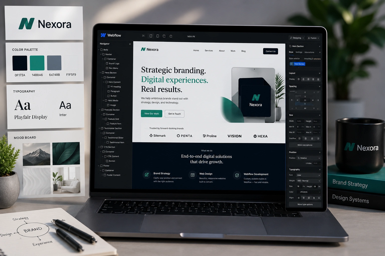
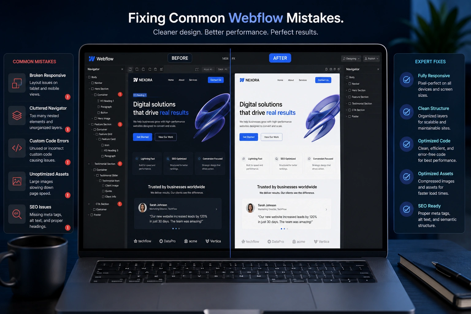
The best part? Modern tools make this smoother than ever. Whether you’re on WordPress or something more advanced like Webflow, the technology exists to make your site fast, beautiful, and functional everywhere.
How a Custom Website Gives You a Real Competitive Edge
Most small businesses still run on generic templates. They look okay at first glance but fall apart when you actually try to use them.
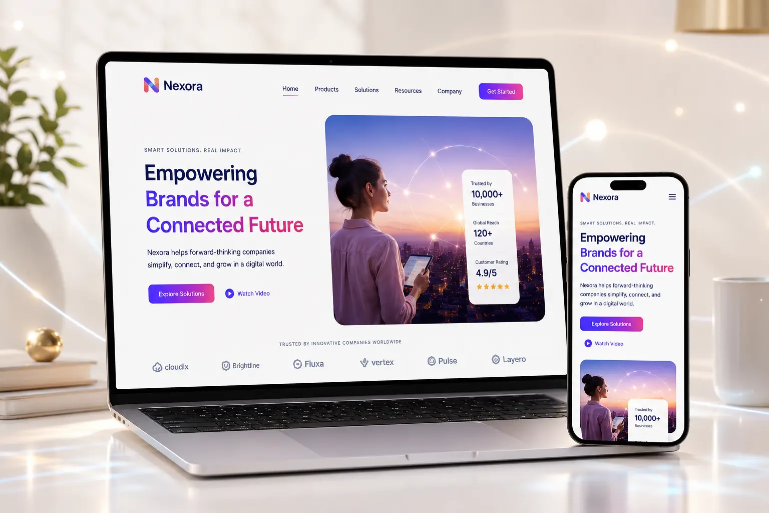
A proper custom website built with responsive web design principles stands out because it’s built around your brand, your audience, and your goals.
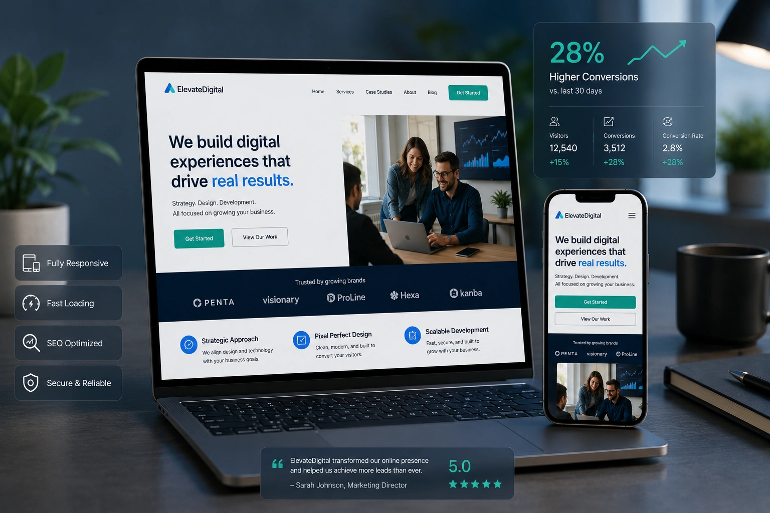
I worked with a coach who was struggling to convert visitors into clients. His old site looked fine on desktop but was nearly unusable on mobile. After a full website redesign services project, his conversion rate jumped. People could easily browse services, read testimonials, and book calls no matter what device they used.
This is the power of treating your website as a true business asset instead of just an online brochure.
The Business Impact: Traffic, Trust, and Revenue
When your site works flawlessly across devices, several good things happen:
- Better search rankings: Google rewards sites that provide great mobile experiences.
- Higher engagement: Visitors stay longer and explore more pages.
- More conversions: Clear calls-to-action and smooth navigation turn browsers into customers.
- Stronger brand perception: A polished, modern site instantly builds trust.
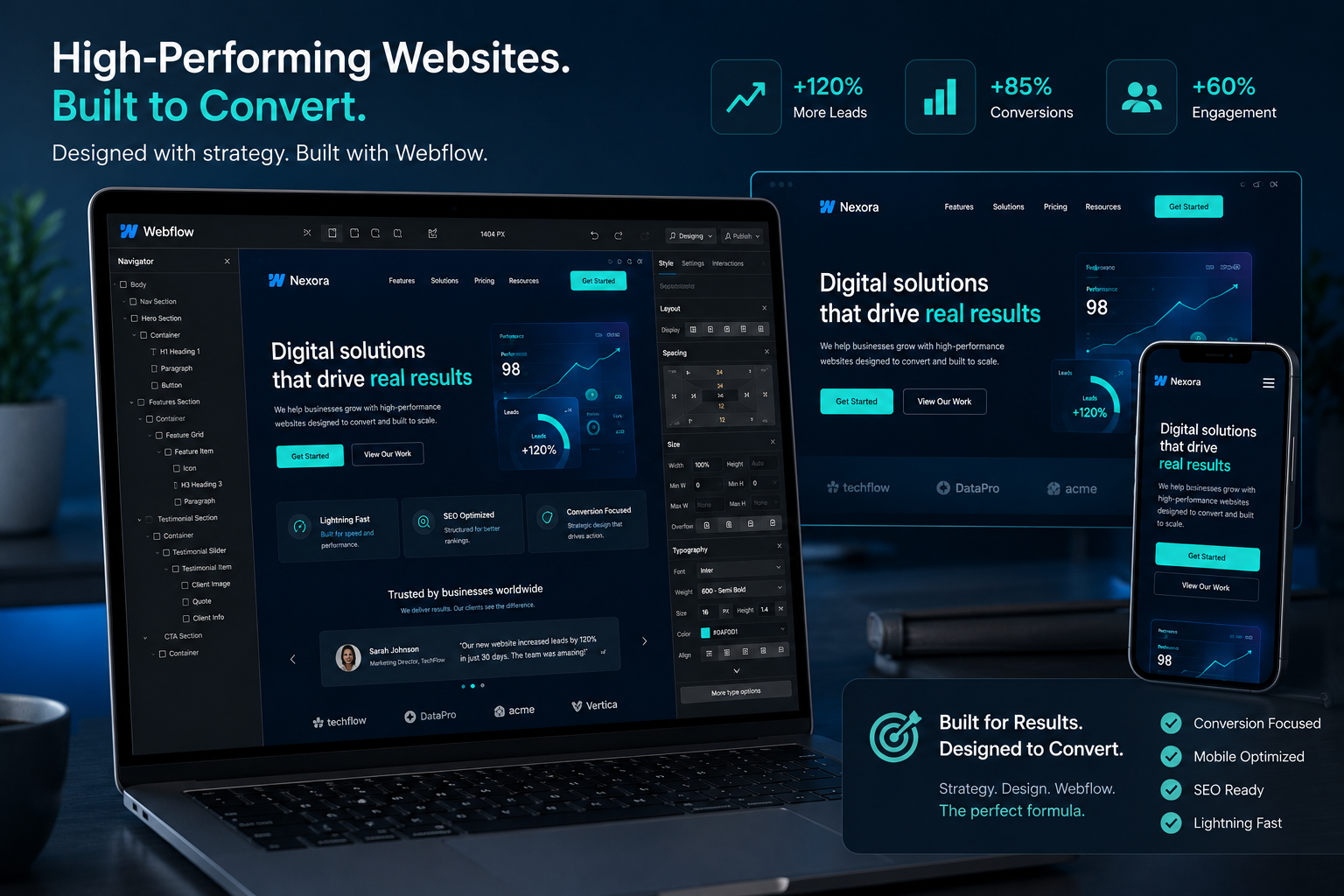
I’ve seen local service businesses double their inquiry rates after updating to fully responsive designs. Online course creators using platforms like LearnWorlds or Kajabi still need their main marketing site to convert visitors effectively — and responsive web design makes that possible.
Step-by-Step: How to Get a High-Converting Responsive Website
Here’s the exact process I follow with clients:
- Audit your current site — Check loading speed, mobile usability (use Google’s PageSpeed Insights), and user flow. Identify what’s broken.
- Define your goals — Are you generating leads, selling products, or building an audience? Every design decision should support these goals.
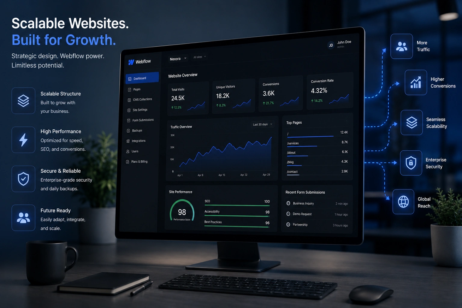
- Choose the right platform — WordPress powers over 40% of the web for good reason .
- Focus on user experience — Prioritize fast load times, clear navigation, readable fonts, and accessible design.
- Test rigorously — Check on real devices, not just browser resize. Fix any issues before launch.
- Launch and monitor — Use analytics to track what’s working and make ongoing improvements.
This isn’t a one-and-done project. The best sites evolve with your business.
Common Mistakes That Kill Your Online Presence
I see these issues all the time when businesses come to me for website redesign services:
- Using outdated templates that aren’t truly responsive.
- Ignoring page speed — huge images and too many plugins kill performance.
- Poor navigation that frustrates mobile users.
- No clear calls-to-action or confusing layout.
- Failing to optimize for local search if you serve specific areas.
Fixing these mistakes often delivers faster results than adding fancy new features. A clean, fast, responsive site beats a flashy but broken one every single time.
For comparison, I’ve seen Shopify stores with excellent responsive design convert significantly better than custom sites that ignored mobile users. The platform handles responsiveness well, but your content and branding still need to shine.
Real-World Example from My Work
One of my clients at Digital Wind IT ran an e-commerce brand selling handmade products. Their old site had a high bounce rate on mobile and looked dated.
We delivered a complete redesign focused on responsive web design. Product images scaled beautifully, the checkout process became frictionless on phones, and we added better filtering. Within three months, mobile conversions increased by over 70%. The brand now feels premium and trustworthy — exactly what they needed to stand out.
FAQ: Responsive Web Design and Website Redesign
How much does a responsive website redesign cost?
It varies widely depending on complexity. Simple professional redesigns can start in the low thousands, while comprehensive custom projects with advanced functionality cost more. The return on investment usually comes quickly through better conversions.
How long does a website redesign take?
Most projects I handle take 4-8 weeks from kickoff to launch. This includes strategy, design, development, testing, and training.
Do I need a websites design company or can I do it myself?
If you have time and technical skills, tools like WordPress make it possible. For most busy professionals, working with an experienced websites design company saves time and delivers better results.
What’s the difference between responsive and mobile-friendly?
Responsive design adapts fluidly to any screen size. Mobile-friendly often just means it works on phones but may not provide the best experience.
How do I know if my current site needs redesign?
High bounce rates, slow loading on mobile, outdated look, or declining traffic are all strong signals.
Is Webflow better than WordPress for responsive design?
Both are excellent. Webflow gives designers more visual control over responsiveness, while WordPress offers unmatched flexibility with plugins and community support. The right choice depends on your needs.
Ready to Transform Your Brand’s Online Presence?
Responsive web design isn’t a nice-to-have anymore — it’s essential. A modern, custom website built with care can dramatically improve how people perceive and interact with your brand.
If you’re tired of a website that’s holding you back, let’s talk. I help businesses through my work at Shihab Morshed and Digital Wind IT. Whether you need full website redesign services or guidance on your next steps, I’m here to help you build something that actually grows with your brand.