More than half of online learning now happens on phones and tablets. If your courses feel clunky on mobile, students drop off fast and your completion rates suffer.
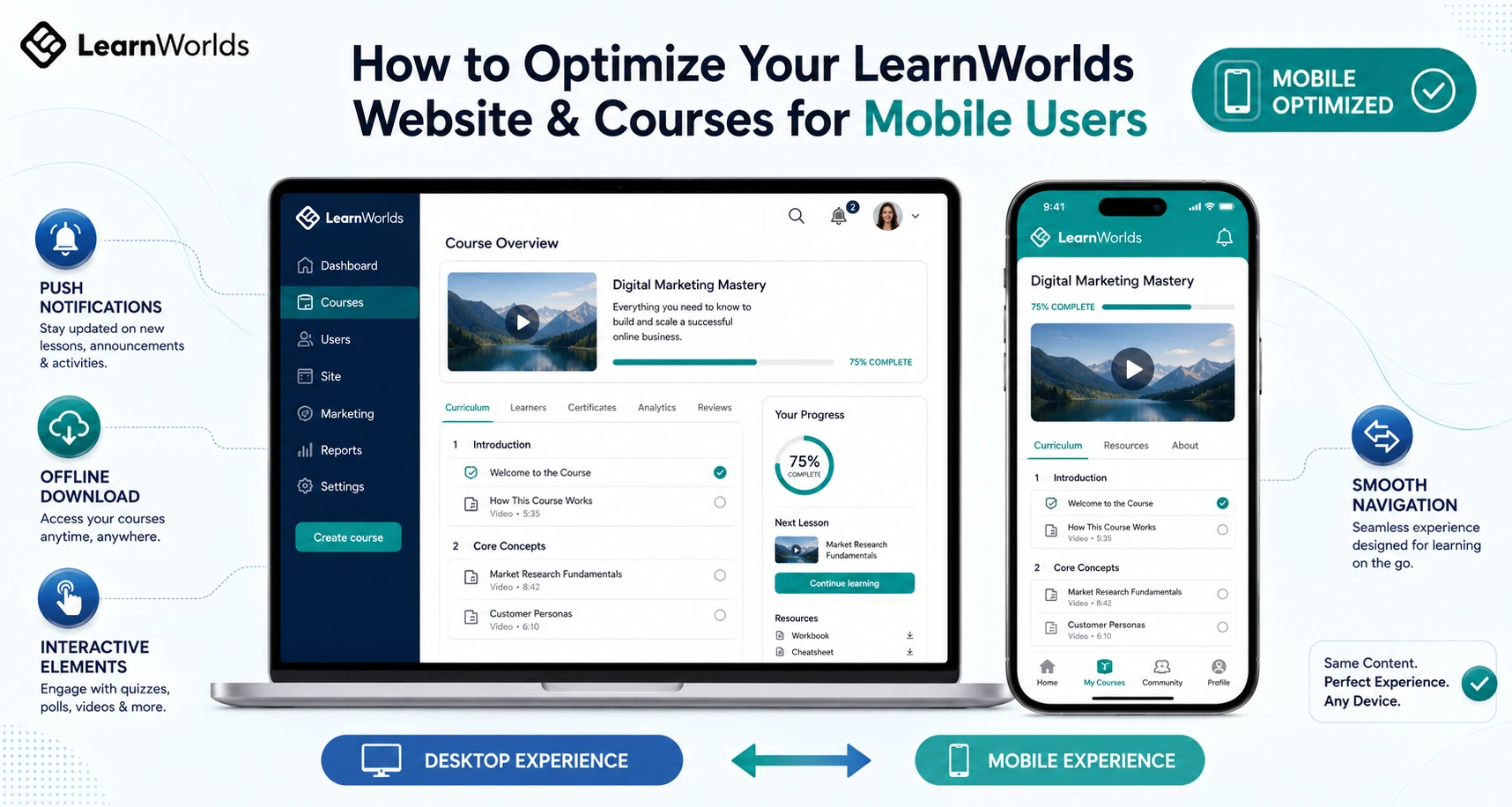
I’ve helped dozens of creators fix this exact problem. LearnWorlds makes mobile optimization straightforward because it’s built as a true online class platform that supports both responsive web design and a full branded native app.
In this guide I’ll show you exactly how to optimize your LearnWorlds website and courses so mobile users get a smooth, engaging experience that actually helps them finish and come back for more.
Why Mobile Optimization Matters When You Create Course Online
Students expect to learn anywhere — during a commute, waiting in line, or on their lunch break. A poor mobile experience leads to frustration, lower completion, and fewer sales.
LearnWorlds handles a lot of this automatically with responsive design, but the real power comes when you go further with their branded mobile app and smart content choices. Creators who optimize for mobile consistently see higher engagement and better reviews.
LearnWorlds Built-in Mobile Features
LearnWorlds gives you two strong layers for mobile users:
- Responsive Web Design: Your academy and courses automatically adapt to any screen size. Navigation, videos, and interactive elements reflow nicely on phones.
- Branded Native Mobile App: This is the standout feature. You can create a fully white-label iOS and Android app with your own logo, colors, and icon — no coding needed. Students get push notifications, offline video downloads, and a dedicated learning experience that feels native.
The visual Mobile App Builder lets you customize screens, navigation, and design elements with live previews. You can also enable biometric login, in-app purchases, and performance analytics.
Official LearnWorlds resources highlight how shifting to mobile-first (and especially a dedicated app) boosts retention significantly compared to responsive-only experiences.
Step-by-Step: How to Optimize Your LearnWorlds Site and Courses for Mobile
Here’s the exact process I use with clients:
- Test Your Current Academy on Real Devices Open your school on a phone and tablet. Check navigation, lesson loading, video playback, and quizzes. Note any awkward zooming or tapping issues.
- Customize Your Responsive Design Use LearnWorlds’ site builder to adjust fonts, button sizes, and spacing for smaller screens. Preview changes across device sizes in the editor.
- Build and Customize Your Branded Mobile App Go to the Mobile App Builder in your dashboard. Choose a theme, upload your branding assets, edit the top bar and navigation, and add key screens. Test with the demo app via QR code before publishing.
- Optimize Course Content for Mobile Keep videos under 10–15 minutes where possible. Add interactive elements like in-video quizzes that work well on touchscreens. Use clear headings and plenty of white space. Enable offline download options in the app settings.
- Set Up Push Notifications and Reminders Configure helpful notifications for new lessons, deadlines, or community activity. Let students set their own mobile learning reminders.
- Enable Advanced Mobile Features Turn on offline video access, biometric authentication, and in-app purchases. Monitor performance with built-in app analytics.
- Publish and Promote the App Prepare screenshots, descriptions, and submit to Apple and Google stores. Share the app link prominently in your courses and emails.
Most creators complete these steps over a focused weekend and see immediate improvements in how students interact with their material.
Real Example: Boosting Engagement with Mobile Optimization
A language teacher I worked with had solid courses but noticed many students only accessed them on desktop. After optimizing the responsive design and launching her branded app with offline downloads and daily practice reminders, daily active users increased sharply. Completion rates rose because students could practice speaking exercises during short pockets of time on their phones.
The app made learning feel convenient instead of another task to schedule.
Common Mistakes and How to Fix Them
Mistake #1: Assuming responsive design is enough.
Fix: Build the branded app — it delivers a much better experience with native speed and notifications.
Mistake #2: Creating long, desktop-style videos and dense text.
Fix: Break content into bite-sized mobile-friendly chunks and add touch-friendly interactive elements.
Mistake #3: Ignoring app analytics after launch.
Fix: Regularly check active users, sessions, and drop-off points to refine what’s working.
Mistake #4: Skipping testing on actual devices.
Fix: Always preview on real phones, not just the simulator.
Data Insight on Mobile Learning
Modern trends show that mobile-first approaches, especially with dedicated apps, significantly improve retention. LearnWorlds users who leverage the app builder often report stronger daily engagement because students can access content offline and receive timely nudges via push notifications.
Frequently Asked Questions
Does LearnWorlds automatically make my courses mobile-friendly?
Yes, the platform is responsive by default, but creating the branded app takes the experience to the next level for mobile users.
How hard is it to build the branded mobile app in LearnWorlds?
It’s surprisingly easy with the no-code visual builder. You can customize design and test in minutes without any programming.
Can students access courses offline in the LearnWorlds app?
Yes. You can enable video downloads so learners can watch lessons without internet connection — perfect for travel or low-data situations.
Do I need a separate plan or add-on for the mobile app?
The Mobile App Builder is available on eligible plans (sometimes as an add-on). Check your dashboard or the official LearnWorlds pricing for current details.
Will optimizing for mobile help me sell more courses?
Absolutely. A smooth mobile experience leads to higher completion rates, better testimonials, and more word-of-mouth referrals.
Optimizing your LearnWorlds website for mobile users isn’t just a nice-to-have — it’s essential if you want to create course online and make online courses that people actually finish in today’s world.
With responsive design plus a branded native app, LearnWorlds gives you powerful tools to meet students where they are: on their phones.
Ready to make your courses truly mobile-friendly? Head over to https://shihabmorshed.com/ and grab my free “Mobile Course Checklist” — it includes specific LearnWorlds setup tips I share with my clients.
You’ve worked hard on your content. Now make sure students can enjoy it anytime, anywhere.
Which mobile challenge are you facing with your courses right now? Leave a comment and I’ll share a quick fix tailored to LearnWorlds.